29 March 2025
Our latest news
-
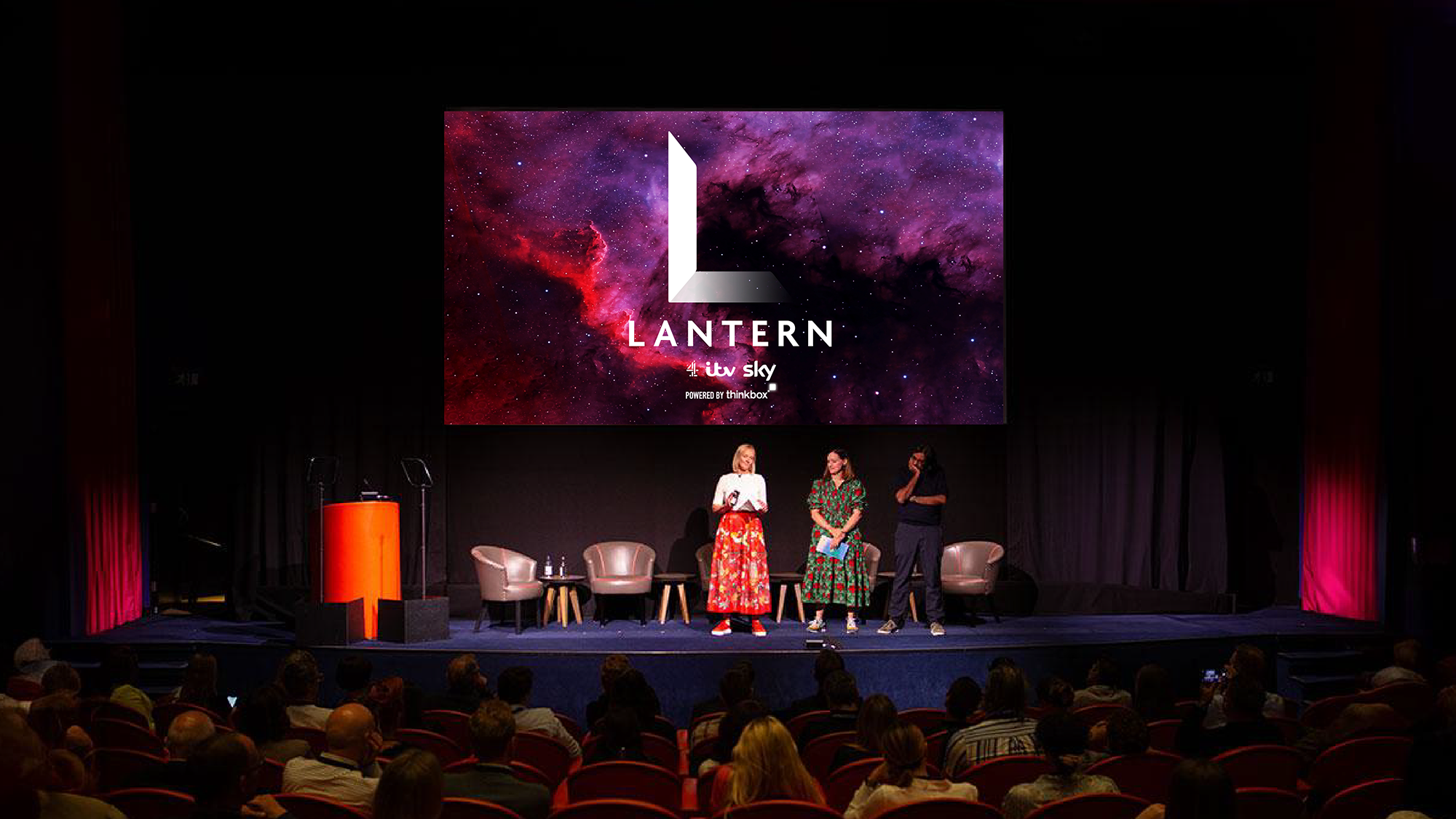
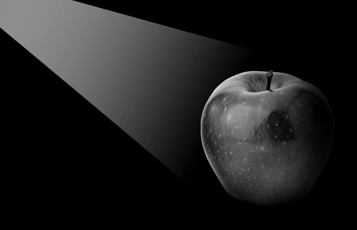
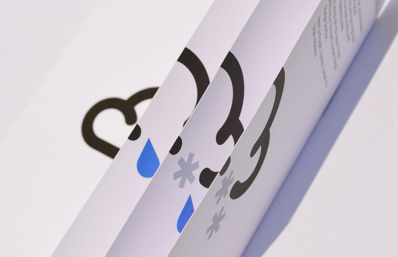
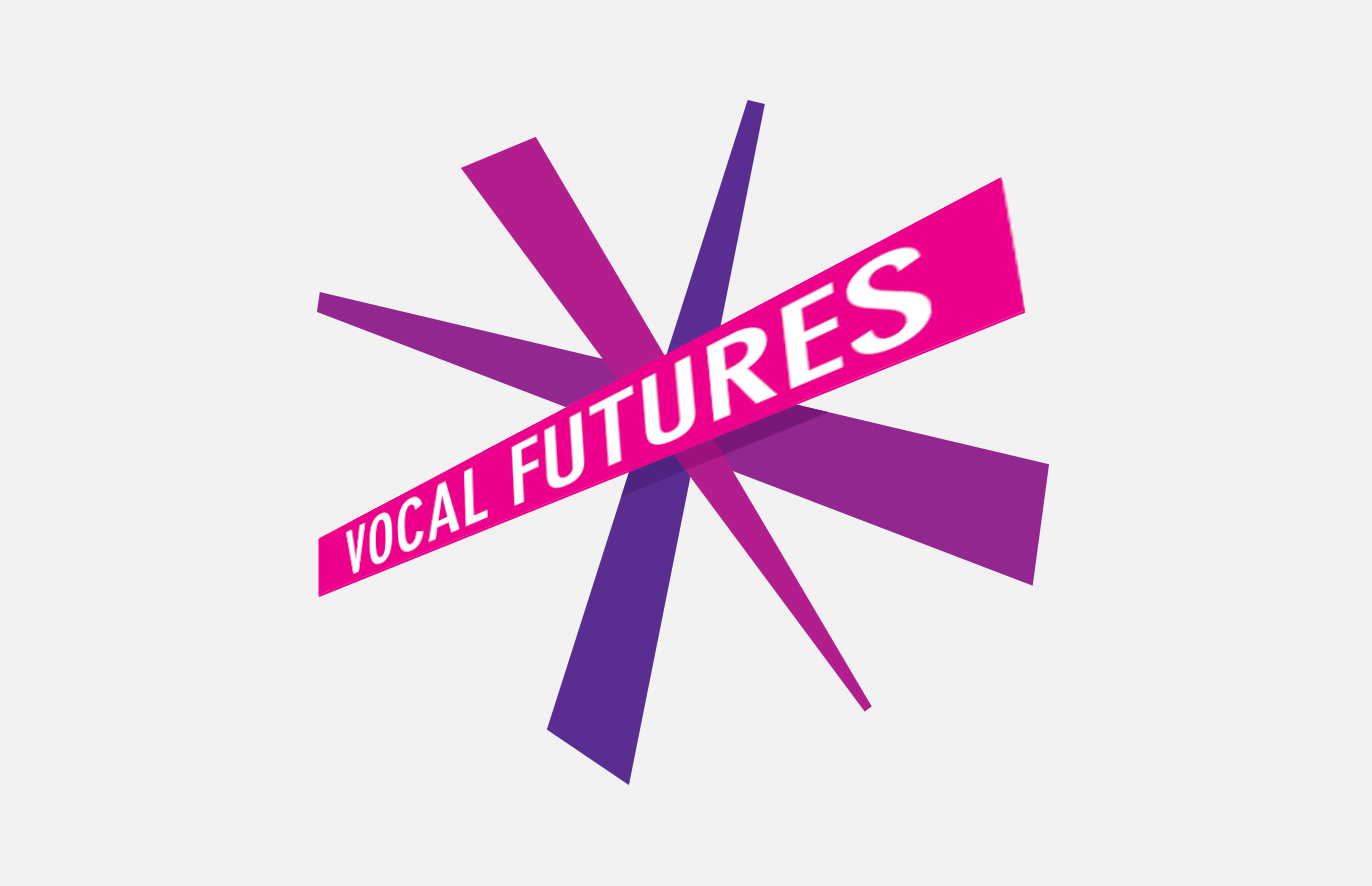
Shedding light on Lantern
We have just created branding for Lantern, a cross-TV collaborative service founded by ITV, Sky, and Channel 4, alongside Thinkbox, the marketing body for UK commercial TV. This new initiative is a cutting-edge measurement and reporting solution being developed for the UK TV advertising market. Lantern will allow agencies and advertisers to tap into a huge data resource pooled from all the major commercial TV channels. Clearly the name ‘Lantern’ references shedding light, so a TV screen was an obvious metaphor.
You can see the case study here.
-
23 November 2023
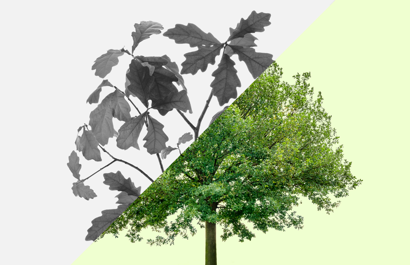
Planting trees
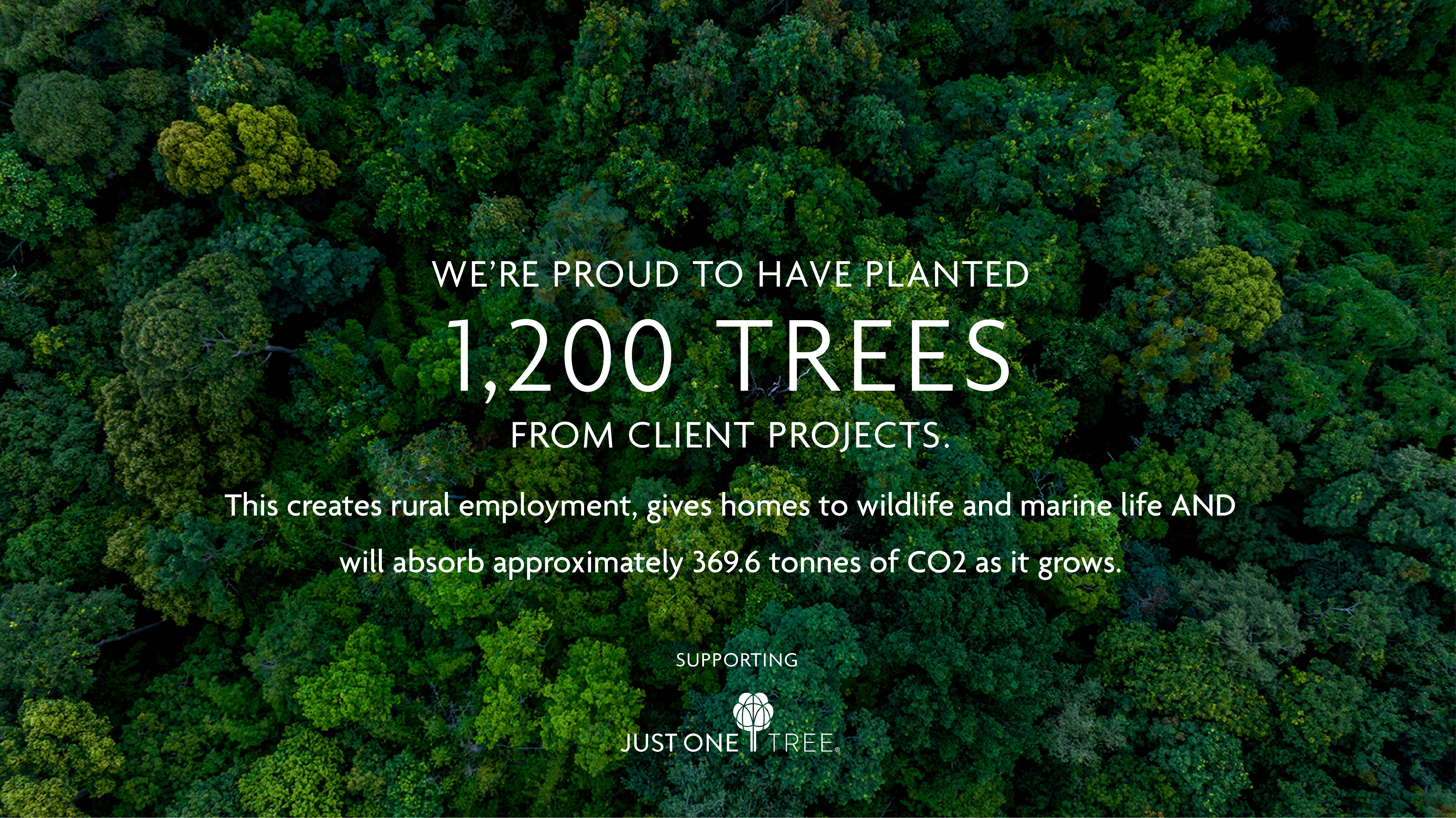
What does 1200 trees look like? A copse? Anyway wherever these trees are and whatever they look like, completing client projects gives us the opportunity to provide a little assistance in the battle with CO2 emissions.
A shout out to Just One Tree for arranging tree planting in places around the world where it counts the most.
-
-
23 November 2023
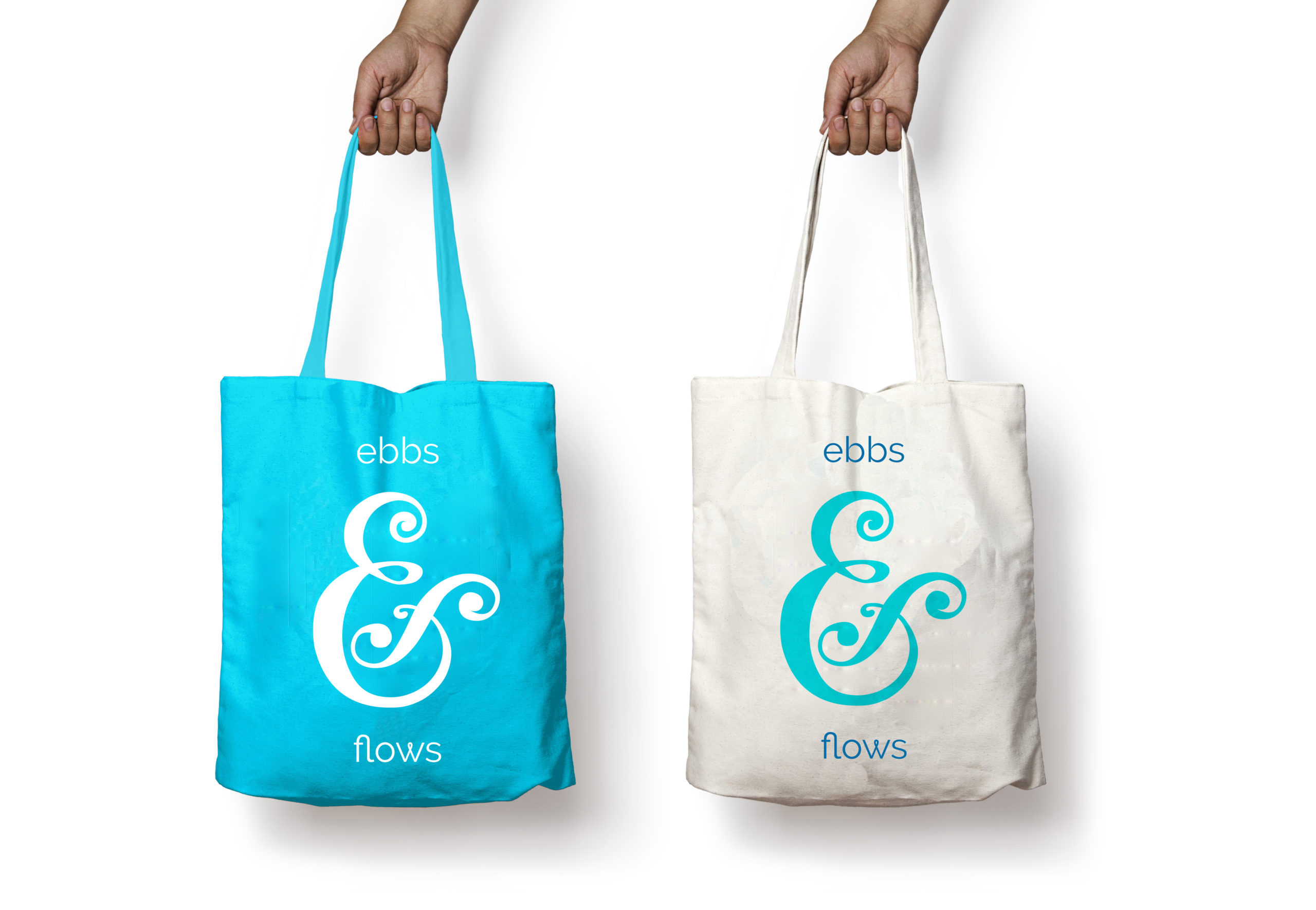
The Ebbs & Flows of life
We have just created the branding for a new venture, Ebbs & Flows, a mindfulness business, running courses and retreats for businesses and individuals. The name reflects the ups and downs of life’s journey – the good news being that the bad times don’t last forever!
Mindfulness is a really powerful tool for anybody – we can all gain from it in our ever increasingly frenetic complex lives.
Lockdown was a reminder of the benefit of taking the time to slow things down a bit, to enjoy the wonder of nature around us and to be kinder to ourselves.
This project was a pleasure to work on, partly because we were dealing with wonderful people, but also we learnt a lot about mindfulness as a tool.
The full case study is here.
-
-
4 March 2023
Carbon Zero Target for LB Hounslow
We are so pleased to have been chosen by the London Borough of Hounslow (where we live and work) to help with their mission to tackle climate change. Our task is to design their Supplementary Planning Document on Climate Change Mitigation and Adaptation.
This is a crucial document providing guidance to all developers wishing to develop new or existing property in the borough, in order for the Council to help meet the government’s national target of Net Zero by 2050.
There is also guidance for homeowners in the borough who are keen to do their bit, so the Council provide a series of measures that can be taken retrospectively to improve the efficiency of their homes.
This document is absolutely fascinating and so important, which is why it is a privilege to have responsibility to make the document user-friendly.
Accessibility is a key aspect of the brief, which is common for councils, but this isn’t really the main challenge. This type of document is being rolled out by boroughs across the country, we’ve seen a number of them (not very inspiring), so we want to create a best in class version – benchmarking a new level of engagement, clarity, structure and accessibility – for others who follow to take inspiration from.
-
-
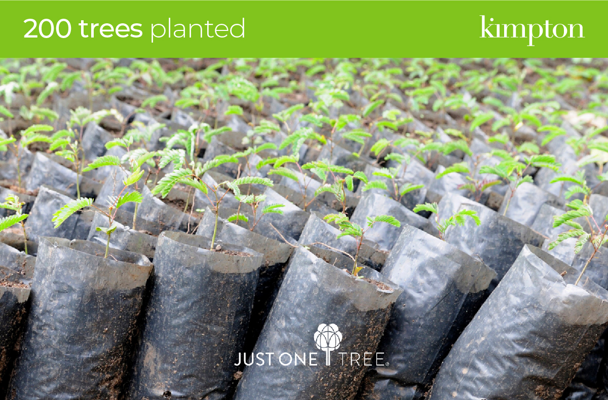
24 February 2023
Just One Tree (or 200)
We’re thrilled to see the effect our first donation to JUST ONE Tree will make to the planet: Our 200 trees will remove approximately 2.46 tonnes of CO2 from the atmosphere per year (61.6 tonnes over the next 25 years).
If you’ve not heard of JUST ONE Tree, they’re a non-profit initiative planting forests both on land and in the oceans. They help to restore biodiversity and combat climate change by planting ‘the right trees in the right place’.
Check out their site to read up on all the epic things this organisation is doing for our people & planet. 🌍
-
-
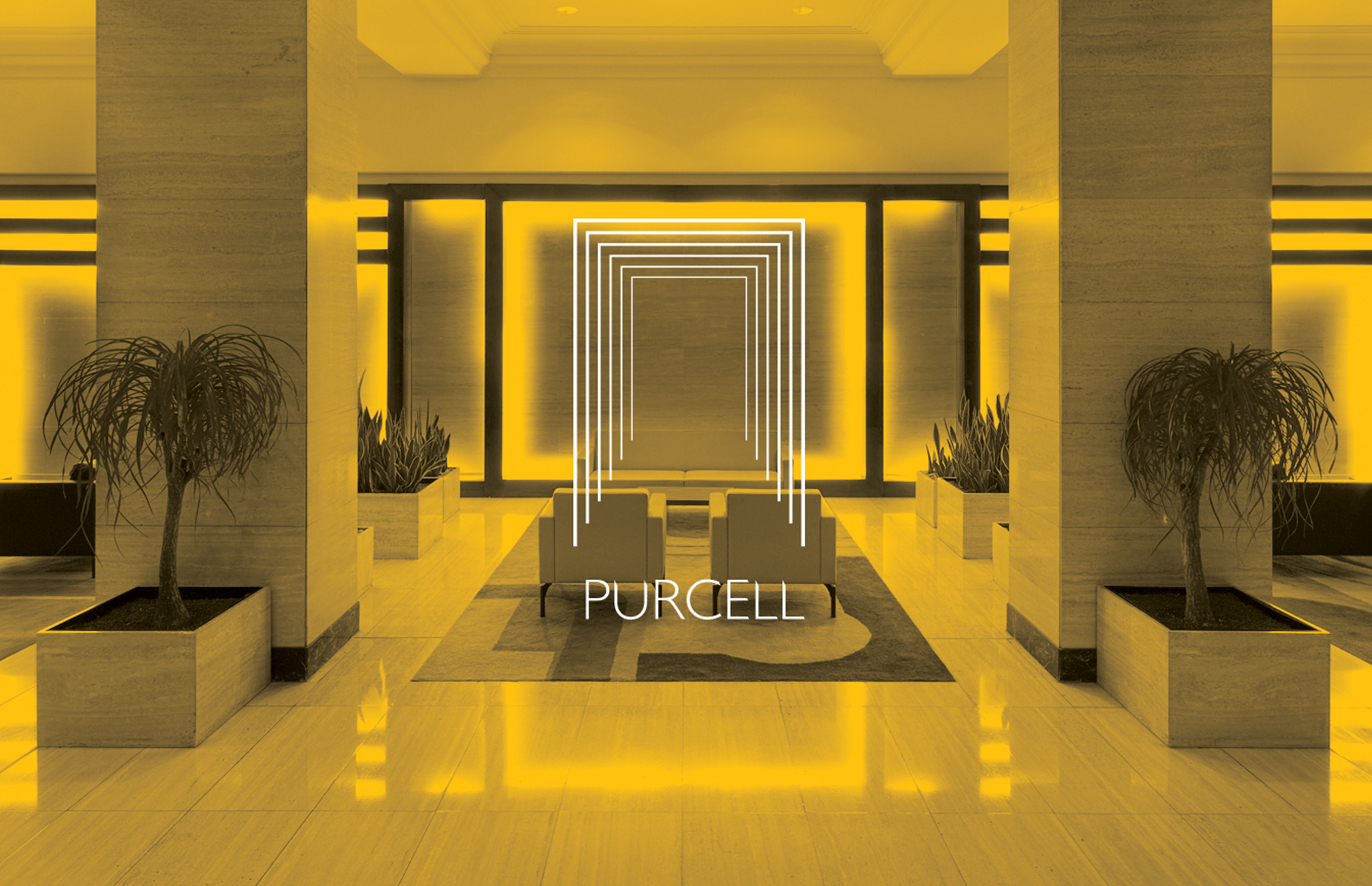
12 February 2023
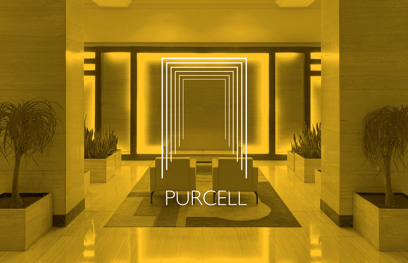
Purcell ongoing works
We’re delighted to be working with esteemed architects Purcell again, following the brand identity project in 2016.
It’s time for them to receive some carefully considered and crafted updates to their branding, whilst retaining their heritage – something they do rather well for their clients!
Purcell has risen to an astounding position in its industry – they are currently ranked No. 1 for Heritage in the 2022 World Architecture 100.
-
-
30 January 2023
Ebbs & Flows
We’re currently creating a brand identity for a newly named mindfulness business Ebbs & Flows. As the name suggests, life is made of a series of highs and lows – sadly we can’t control the lows, but we can control how we deal with them. And this is where mindfulness is so valuable.
Two qualified practitioners are coming together to offer online courses and retreats for both individuals and business leaders. Their combined expertise and the fact that they borrow from the best of Western science and Eastern tradition for their teachings provides a powerful offer.
Unbelievably their names are… Debs & Rose.
-
-
11 January 2023
Just One Tree
We’re delighted to launch a new initiative to help do our bit for the planet. We are offering to plant 100 trees for every project we design – with the help of at the charity organisation Just One Tree. They arrange for trees to be planted in a number of countries from Brazil to Zambia, in locations that maximise their effectiveness. As we start 2023, we already have several projects on the go, which will be our first projects contributing to the scheme.
See more about Just One Tree here.
-
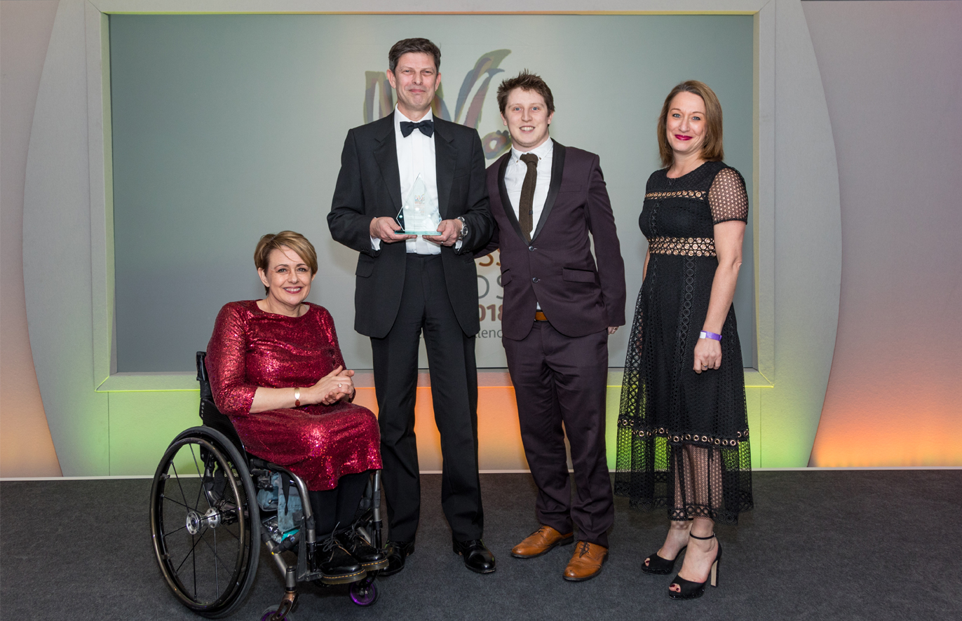
16 November 2022
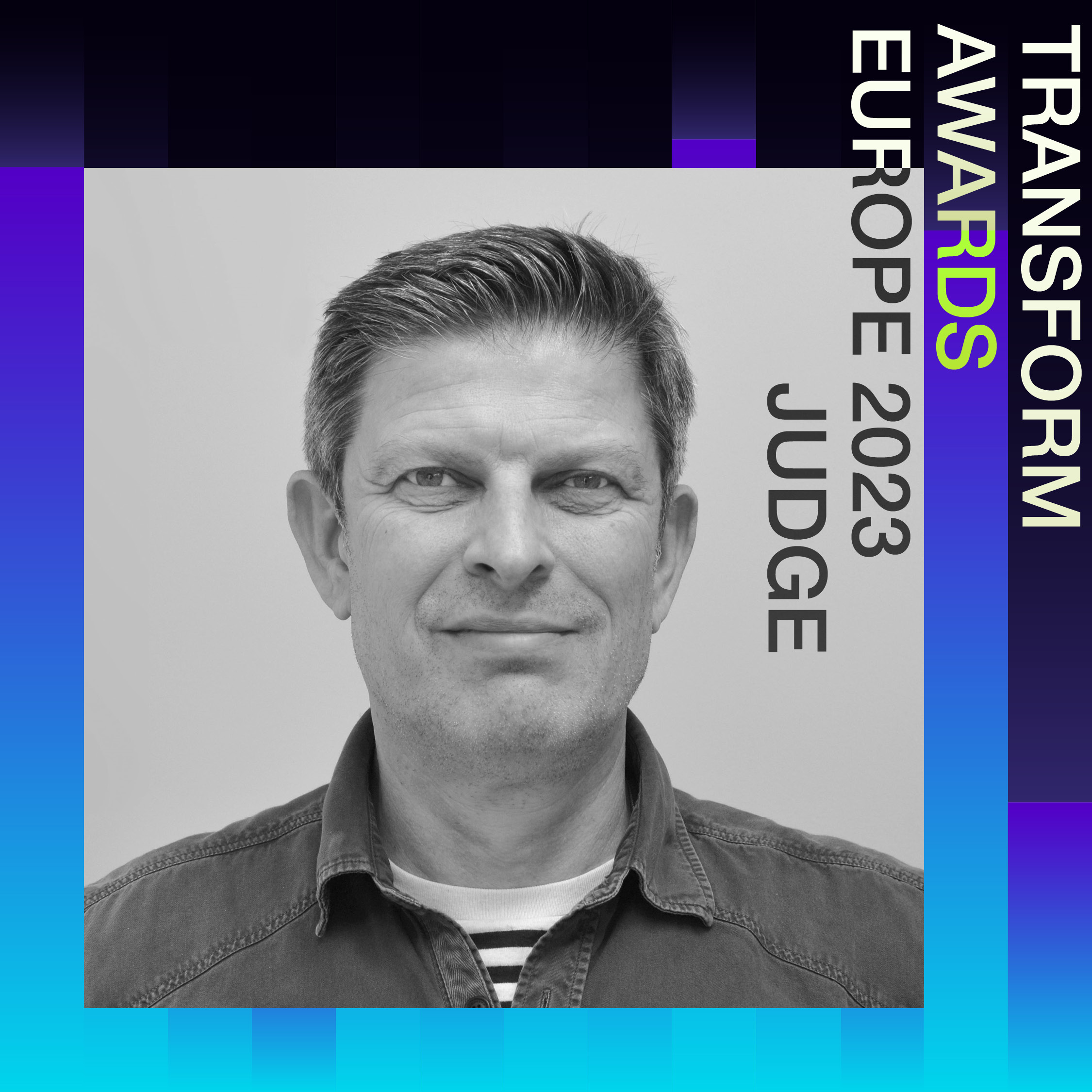
Judging at the Transform Awards Europe 2023
David Kimpton our founder and creative director has been asked to join the judging panel at the Transform Awards Europe 2023.
Transform magazine honours and rewards the most innovative, creative and successful brand work across the world. Covering six regions including Asia, North America, Europe, Nordics and MEA, each of the prestigious award programmes focuses on specific aspects of the branding process and provides a platform from which to benchmark and showcase excellence.
Kimpton Creative was awarded the Grand Prix in 2022.
Find out more about the Transform Awards here: https://www.transformmagazine.net/awards/
#TransformAwards #Transformmagazine
-
-
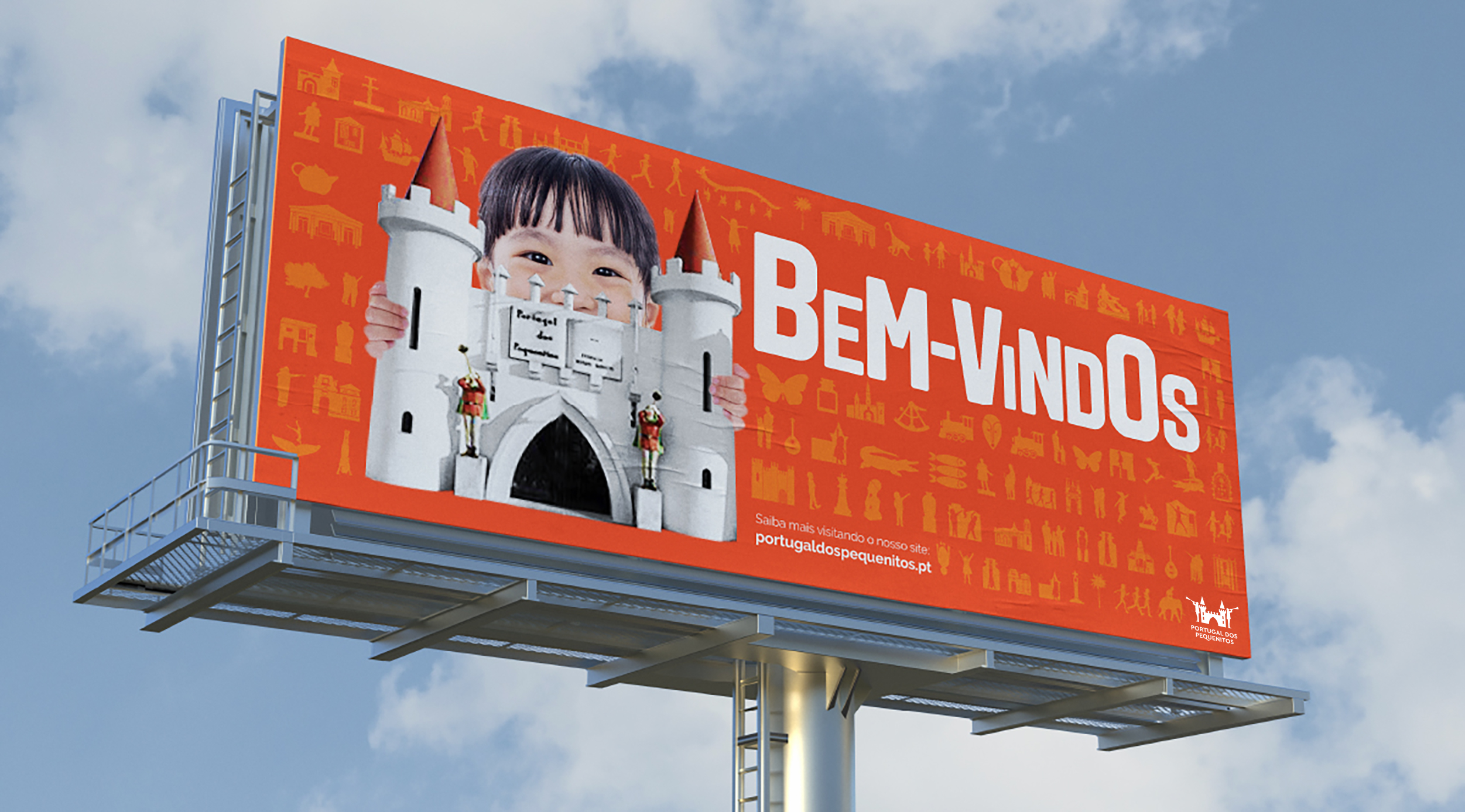
3 October 2022
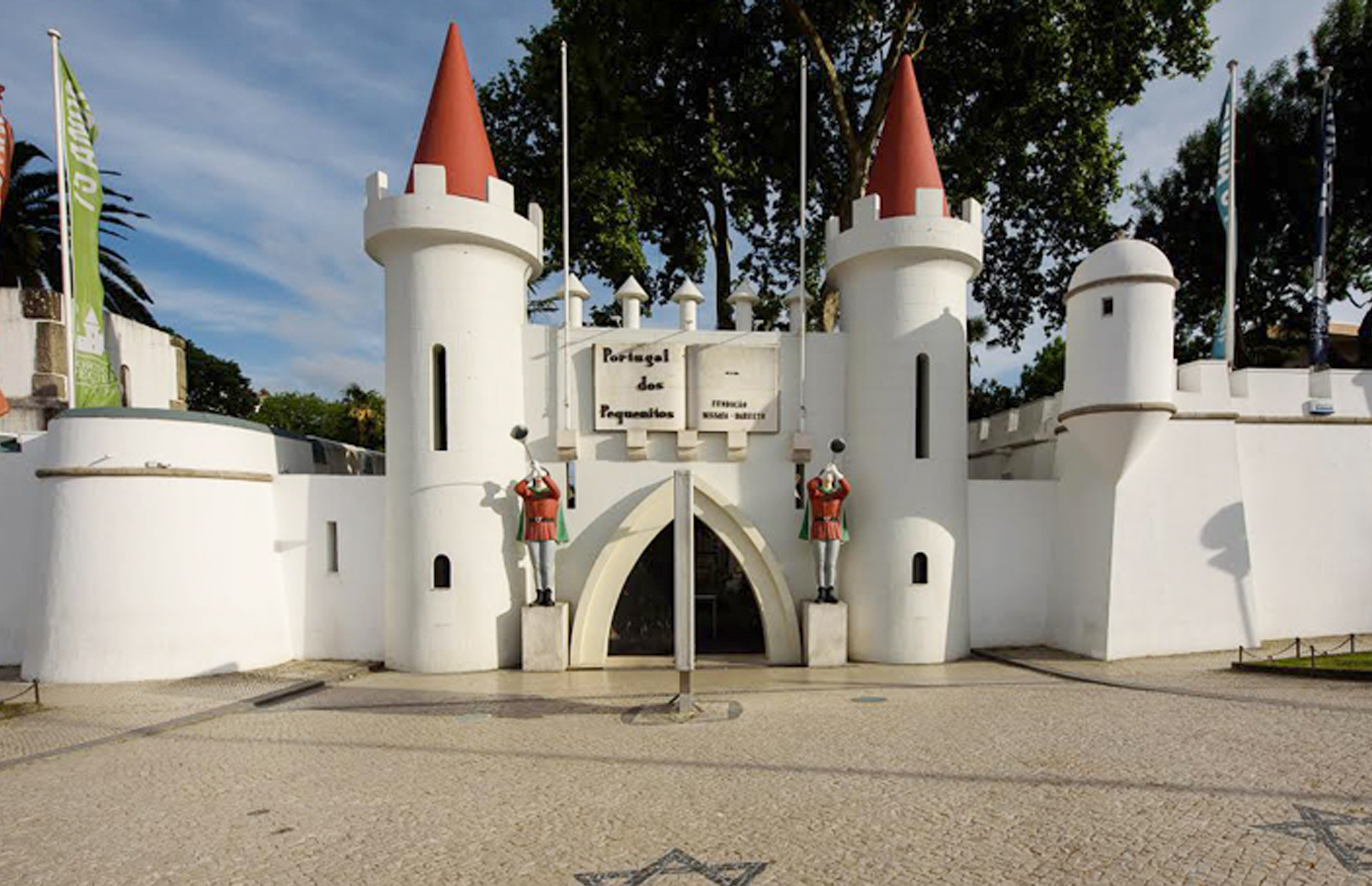
New brand identity for Portugal dos Pequenitos
As one of Portugal’s most iconic and internationally renowned visitor attractions, it was an absolute delight to rebrand Portugal dos Pequenitos (Portugal for the little ones), a children’s miniature architecture park.
Having visited and appreciated what this place offers, it was clear to us where we should go with the identity. Following the words of the park’s founder Bissaya Barreto “Let all those who visit be happy”, we were keen to express the joy of children running in and out of little houses exploring and discovering things about Portuguese life and culture.
You can see the full case study here.
-
-
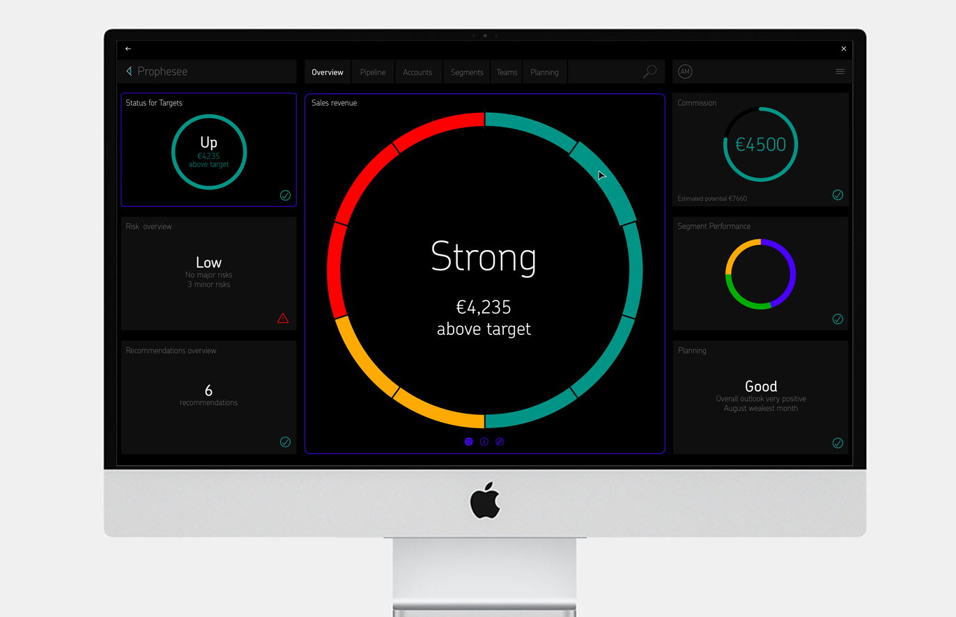
23 June 2022
A new dashboard design for a new client
We have recently been working with our new client 3RDi, to design the interface for their AI enabled sale software platform called Prophesee. Input the usual information required to document potential client project status and the platform will tell you what actions are recommended to achieve targets.
Beautification and simplicity of complex information were high on the agenda, but what really solved it them was to create a large central area to focus attention on any one subject chosen from the surrounding borders, to present more specific detailed information front and centre of the screen. This helped to resolve the presentation of complex information simply, where most competitor dashboards present all information including the kitchen sink together.
See the project here…
-
-
8 June 2022
Five minutes with David Kimpton
Our founder and creative director David Kimpton was asked to discuss the project that won Kimpton Creative the Grand Prix at the Transform Awards Europe 2022.
Here he describes responding to the changing nature of recruitment, how that led to his solutions and where branding is heading:
https://www.transformmagazine.net/articles/2022/five-minutes-with-david-kimpton/
-
-
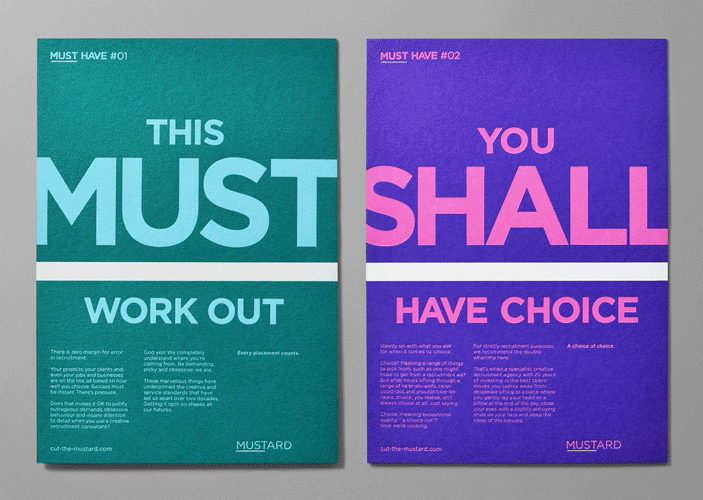
31 March 2022
Kimpton win Transform Awards Grand Prix
Absolutely thrilled with last night’s awards at the #TransformAwards, especially the Grand Prix award, two golds, a silver and a bronze all for Mustard creative recruitment agency.
Our thanks to client Ian Coulson for allowing us to be audacious, and Scott Perry, Bard of Bray, strategy partner and copywriter extraordinaire.
This is what the judges said:
Shifting focus from simply filling roles to considering the crucial, emotional moment when a candidate finds the exact right opportunity provided recruitment agency Mustard with the inspiration for a rebrand. It worked with Kimpton Creative to use humour to break the tension in the job-hunting process.
Mustard transformed the recruitment process from stressful to creative, emotional to decision-making, reactive to proactive.
“Shocking, bold, bolshy and thought-provoking,” said one judge.
Another added, “One of the best entries I have ever seen. They have really thought about their target audience. It highlighted the urgency felt when recruiting and looking for a new role in a simple, but effective way.”
To win the ‘Grand prix,’ a company has to not only rebrand effectively, but it has to redefine its own role within its sector, and, like Mustard, redefine its sector through rebranding. Creative industry recruitment has always been a challenge. But, Mustard recognised the opportunity to reframe recruitment. Instead of focusing on transactions, Mustard wanted to highlight its ability to find the exact right person for the right opportunity.
It worked with Kimpton Creative on a copy style that is fun, reassuring and has a sense of the imperative to it. Peppered with words like ‘shall,’ ‘must’ and ‘can,’ the copy style speaks to creatives in their own language. The visual identity kept things simple, using simple colours, striking letterforms and quality printed materials to communicate Mustard’s offer.
Throughout the awards, judges – members of the creative community themselves – thought this brand stood out.
“I think they have completely understood their target audience. It’s witty, fun and like nothing else in the sector,” said one judge.
Another said, “I love this brand and strategy. It’s the perfect balance of looking good and sound great.” Its authenticity, creative thought and originality rang true, making it a worthy winner of this year’s Transform Awards ‘Grand prix.’ -
-
13 December 2021
Silver award at Transform Awards North America
Our brand refresh for Ayming has been awarded Silver for ‘Best brand evolution’ at the Transform Awards North America. This is the third year running we have been awarded for the Ayming identity.
This is testament to how well the Ayming international marketing teams are implementing the branding.
Judges thought this was a “well-executed international brand evolution.” One called it “friendly and powerful.”
This project was very much about evolving the brand from an existing logo and how to create a new narrative around that.
We are proud that our work for Ayming has been so well received as an international brand.
-
-
8 September 2021
More success at the Transform Awards North America
Our brand refresh for Ayming has been shortlisted to win ‘Best brand evolution’ at the Transform Awards North America. This is the third year running we have been awarded for the Ayming identity.
According to Transform, ‘The companies shortlisted are those that have excelled in benchmarking their work… these companies are leading the way in communications and deriving value from their brands.’
This project was very much about evolving the brand from an existing logo and how to create a new narrative around that.
We are proud that our work for Ayming has been so well received as an international brand.
We are in esteemed company too, with the British contingent including Superunion, Pearlfisher, Together Design, Turner Duckworth and Interbrand.
-
-
15 July 2021
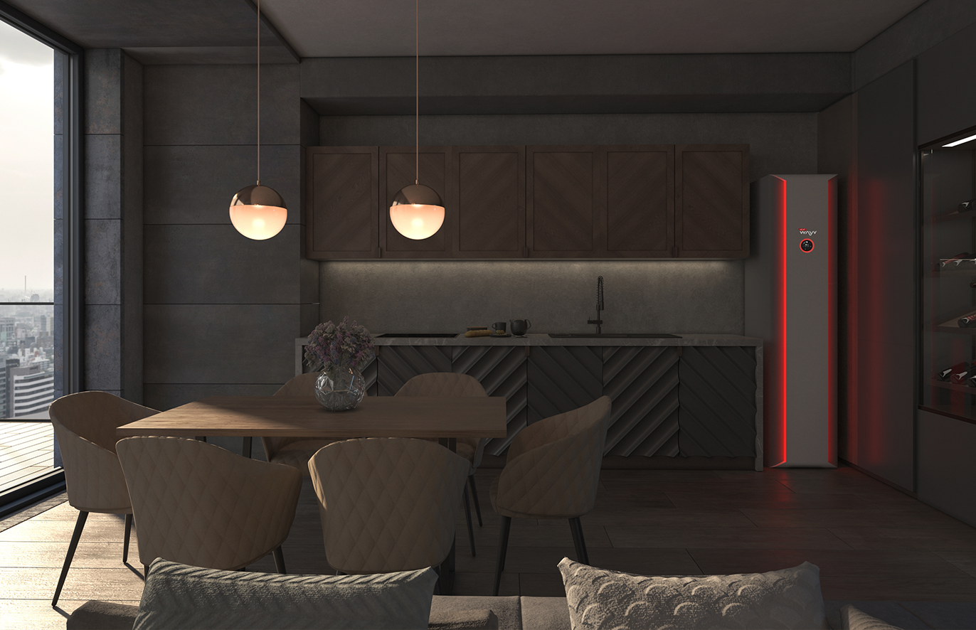
New client win – HeatWayv
We are delighted to be working with HeatWayv, a very exciting tech business looking to offer the world a solution to the upcoming phasing out of gas boilers. They have developed a revolutionary zero emission microwave boiler and we are helping them to take the concept to the government and investors.
The world needs businesses like HeatWayv. The UK is bursting with them and it’s very exciting for us to play a part in taking action to save the planet.
Photo by Ali Kazim on Unsplash.
-
-
21 April 2021
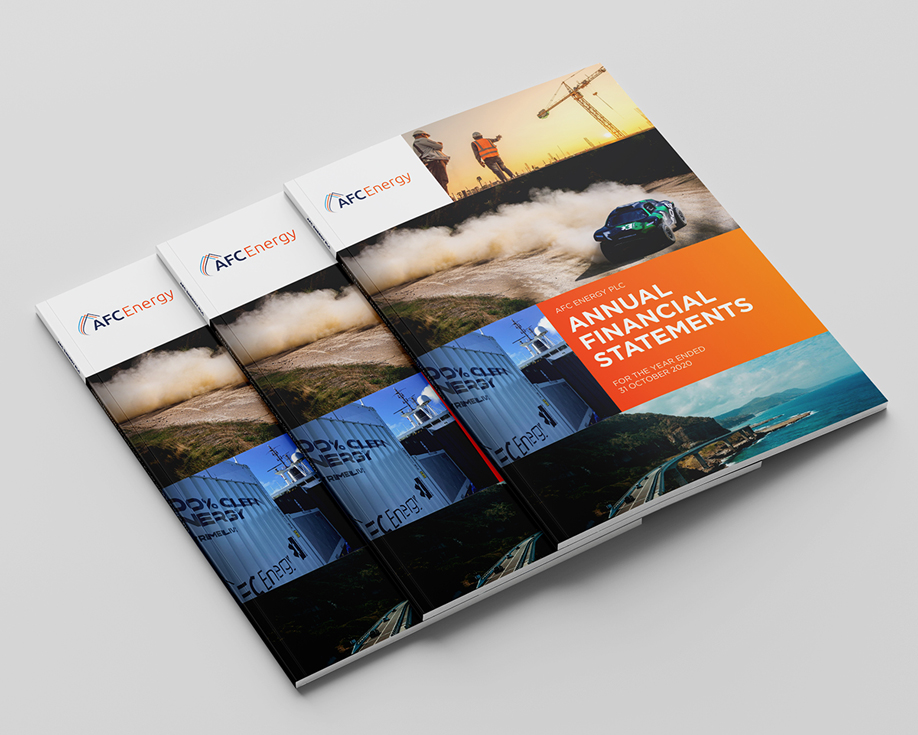
AFC Annual Report Case Study
We have recently completed AFC Energy’s Annual Report. AFC Energy creates hydrogen-powered alkaline fuel cell systems with the aim to decarbonise energy. This reporting year has seen them make a significant breakthrough, transitioning from an R&D business to a commercial business manufacturing and selling its hydrogen technology.
The project was led at the client end by the new Head of Communications Iain Thomson, who miraculously guided the project from start to finish in just five weeks!
Their technology was in action with the Extreme E motor racing series, which launched 3rd/4th April. We enjoyed watching it on ITV on Easter Sunday!
-
-
24 February 2021
AFC Energy Annual Report
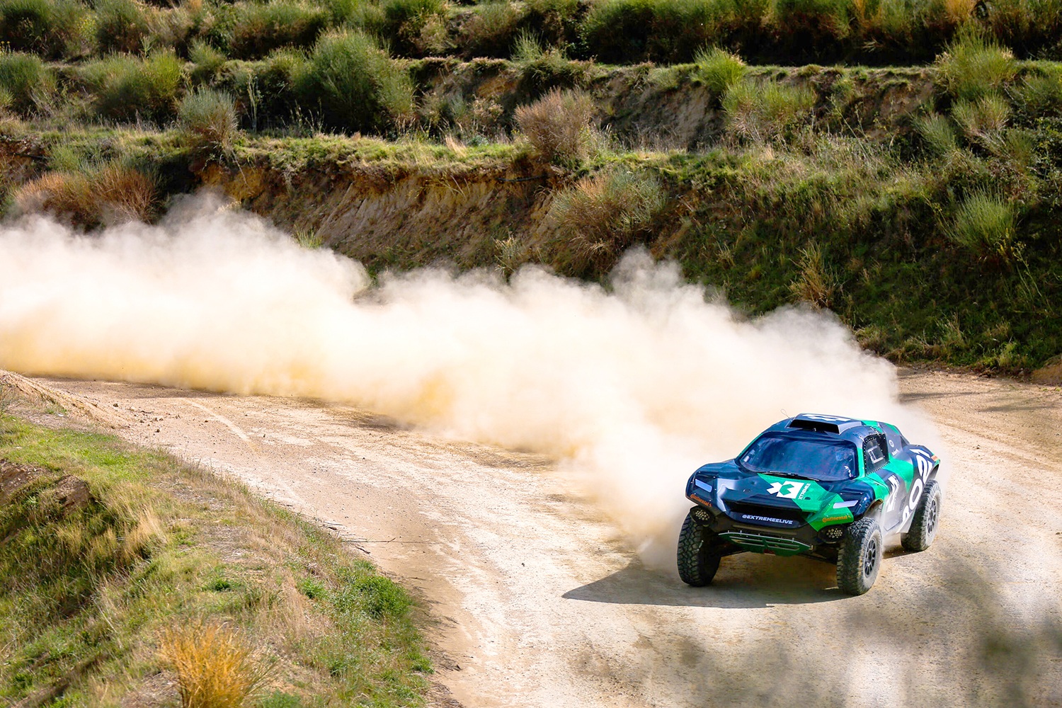
We’re delighted to be working with AFC Energy on their 2020 Annual Report. We’re especially excited that they are going to be supplying their new hydrogen-powered alkaline fuel cell system to the Extreme E racing series – a brand new motor sport, racing souped-up electric SUVs in extreme environments, to raise awareness of the climate crisis. Nico Rosberg, Lewis Hamilton and Jenson Button all have their own teams, Button actually driving his own team’s car.
AFC Energy are going places – fast!
(photo © Charly Lopez/Extreme E) -
-
23 December 2020
Obituary: Andrew Zulver 1954-2019
Our founder, David Kimpton, has written an obituary for industry great Andrew Zulver.
Sadly he succumbed to a rare neurological condition, Progressive Supranuclear Palsy, a generative disease with no cure. A wretched end to a life so full of vitality.
-
-
4 December 2020
Transform Awards North America Win
We are pleased to share the results of the Transform Awards North America. Our work for Ayming was awarded a bronze award in the ‘Best implementation of a brand development project’ category.
The awards, now in it’s 6th year in America, were presented virtually for the first time. However what hasn’t changed is the same high standard and an emphasis on transformative work.
We’re thrilled to pick up another award for Ayming, who are a joy to work with! #furthertogether
-
-
13 November 2020
Transform Award North America Shortlist 2020
We are pleased to share we’ve been nominated for a North American Transform Award! Our work for Ayming is in the running to win ‘Best implementation of a brand development project’.
According to Transform, ‘The companies shortlisted are those that have excelled in benchmarking their work… these companies are leading the way in communications and deriving value from their brands.’ We are proud that our work for Ayming is so well received and has picked up another nomination.
We’ve got our fingers crossed and clapping hand emojis ready for the the virtual awards event on 2nd December!
-
-
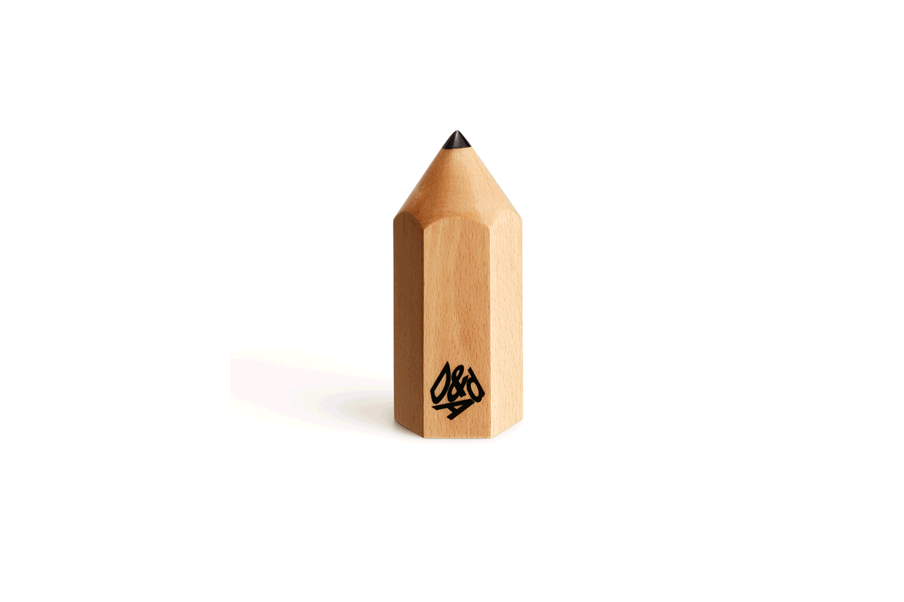
11 September 2020
D&AD Pencil for Pencils
The D&AD awards were presented last night and we’re proud to share our pencil cases for Mustard have been awarded a pencil of their own! We have been awarded a wood pencil in the ‘Writing for Design’ category.
It has been great fun to work on such an exciting brand. As well as working closely with Mustard, it’s been a joy to collaborate with copywriter Scott Perry, The Bard of Bray.
To see the case study go here.
-
-
7 September 2020
D&AD Shortlist
We’re excited to share that our work for Mustard has been shortlisted in D&AD’s writing for design category! Praise must also go to collaborator Scott Perry, The Bard of Bray
To see the case study go here.
The results are released next week, so we’ve got everything crossed until then!
-
-
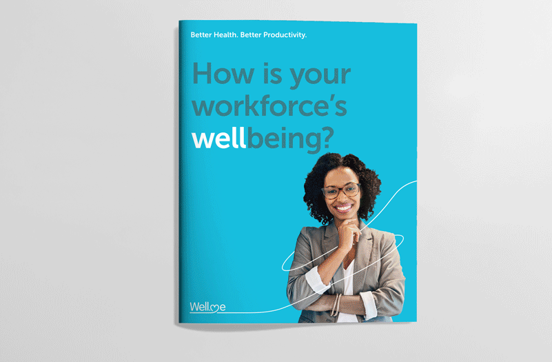
28 August 2020
All’s Well…
We’d like to share our recent work for health and wellbeing company, Well.Me.
They improve how organisations look after the welfare of their employees. They have developed the ‘Wellpoint health kiosk’ as well as the ‘Well.Me digital platform’. These both help ‘provide easy and convenient access to health screening, removing traditional barriers and engaging individuals who rarely or never see a health professional.’ They count the NHS, BBC, RNLI and BMW (to name a few) as their clients.
We have refreshed their logo and created a visual language: a continuous line that represents the journey from your current fitness and wellbeing to improved health. It acts as a powerful and flexible device that creates icons and interacts with imagery across various touchpoints (including their new website and brochure).
See the full case study here.
-
-
14 July 2020
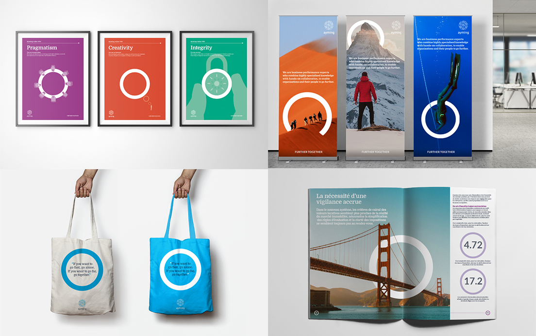
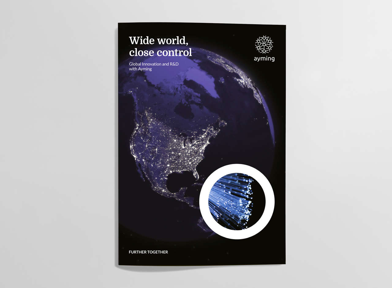
Ayming Innovation Brochure
Ayming wanted a brochure that could express their global expertise in the area of innovation.
When it comes to innovation they not only have a big picture view, but are also well versed in the finer details and this inspired our solution. We used large relevant imagery that depicted the big picture, and then within their brand circle, we placed another image which compliments the bigger one and shows the detail that others miss. This then creates a suite of imagery that metaphorically depicts the dual perspectives that Ayming use to bring success to their clients through innovation.
See the brochure case study here or the Ayming identity case study here.
-
-
11 June 2020
Ayming Video
We recently created a video for Ayming for both general corporate use and for their job dating events to recruit employees. The concept was to expand on their strap line ‘Further together’ in an exciting and emotive way. The key was to bring Ayming’s circle device into play, something that gives them ownership of the video.
-
11 May 2020
Fresh Awards Winner
We are proud to announce that our pencil boxes for Mustard have been awarded Silver in the Writing for Design category at the Fresh Awards.
The Fresh Awards ‘ensure that strong creativity in design is embraced and rewarded’. They are also constantly innovating in the creative awards sector and this year had two judging panels (one outside of the M25 to judge the work originating from London, and one in London responsible for awarding the regional work).
We look forward to getting our hands on the beautiful trophy!
To see the case study go here.
-
-
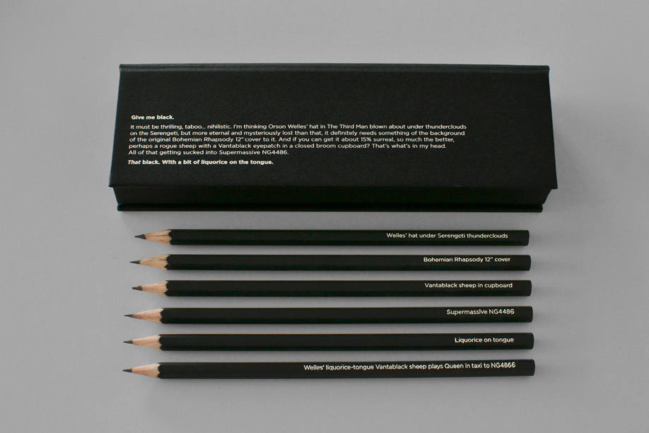
17 April 2020
Mustard Launch
We’re proud to share our rebrand for Mustard, creative recruitment experts. They recognised that they needed to respond to changes in the creative industry’s recruitment demands: clients regularly request talent with ever-more specific skills and experience. The solution needed to be highly crafted and conceptually strong to appeal to its designer audience.
We did this by underlining the ‘MUST’ in the name to reflect the urgency and importance of getting placements right. We used typography to increase the sense of stress, enlarging key words. And then we used humour to let off steam and make our point: crazy, truly impossible demands… but if anyone can meet them, it’s us. The tone is key: calm and good natured in the midst of a storm… people you can count on.
As well as the identity we designed a website and a series of promotional items. This included a set of black and grey pencils, with matching boxes. These push the idea that when you have a tricky brief Mustard’s attention to detail is the only way to answer them. We have heavily collaborated with copywriter Scott Perry, the Bard of Bray, to help strike the right balance of absurdity and wit.
See the case study in full here.
-
-
16 March 2020
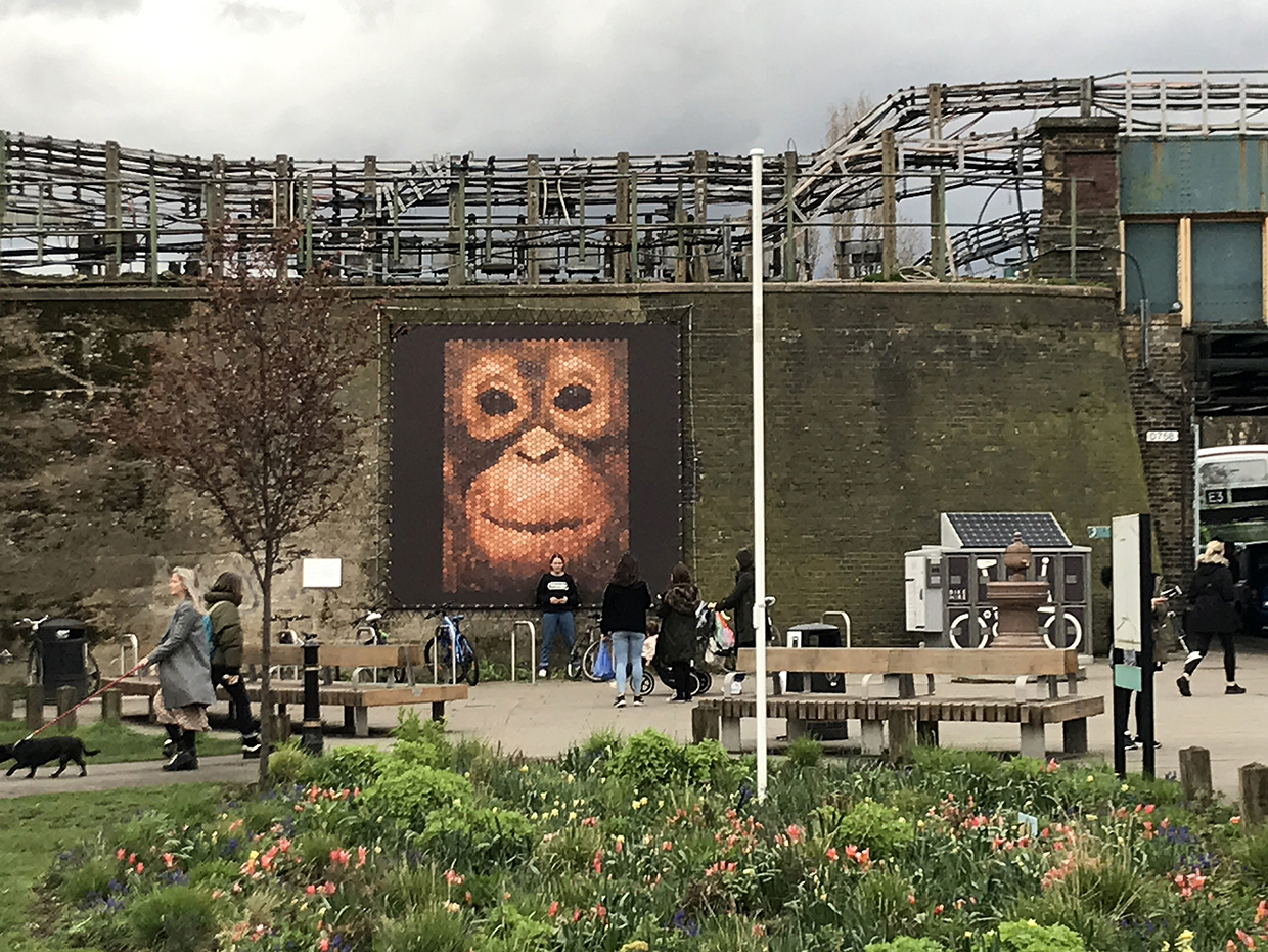
Chiswick Fourth Plinth Winner
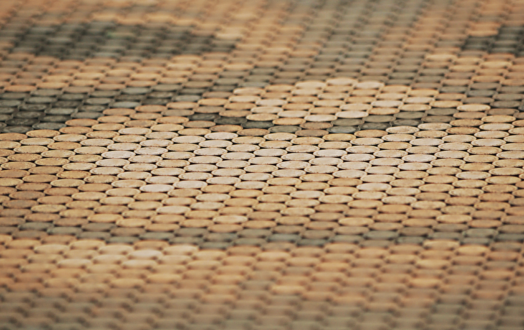
We’re proud and delighted to be the winner of the ‘Chiswick Fourth Plinth’ competition, a public art display near Turnham Green Tube organised by Abundance London, a public art charity. Our artwork ‘Penny the Orangutan’ was originally created for the Sumatran Orangutan Society in an effort to help them raise funds to help endangered Orangutans, with the message ‘every penny counts’.
The artwork involving 2,000 pennies stuck to a board, was auctioned by the charity, but the image that we affectionately call ‘Penny’ has subsequently had a life of its own, winning design awards and now appearing as a large four metre square outdoor display. It’s fantastic to witness the public engaging with it.
A big thank you to all of those who voted for Penny.
-
-
4 March 2020
Transform Awards Europe win
We are proud to announce that we have won a Silver Award at the Transform Awards Europe for our rebrand of Ayming in the Best Identity for Professional Services category! One judge commented that we had achieved “a really beautiful rebrand with a clear strategy and exceptional results”.
Established in 2009, the Transform Awards has evolved into a celebration of the indispensable talent that exists within the branding sphere. It covering Asia-Pacific, the Middle East, North America and Europe. The awards consistently set a stronger benchmark for work in brand development while reflecting the growing significance of brand in strategic corporate communications. The corporate brand – and its implementation, positioning and creativity – has become one of the most valuable assets a business owns. The implementation, positioning and creativity of the corporate brand is becoming an increasingly treasured business asset. The Transform Awards evaluate exemplary work in brand development and acknowledge the growing significance of brand in strategic corporate communications – developing and sustaining a strong brand is imperative for success.
Brittany Golob, publishing editor at Transform magazine, says, “At the Transform Awards, shortlisted companies represent every sector and size of organisation, presenting a true benchmark for excellence in strategic brand work. The breadth of the shortlist exemplifies the broad spectrum of brand development work recognised by the awards, from visual design to tone of voice to wayfinding and signage. Every single company on that list deserves congratulations for delivering excellent, creative brand work. Congratulations to all of the 2020 winners!”
To see our work for Ayming click here.
-
-
16 December 2019
Shortlisted Transform Awards Europe 2020
One month after being awarded Silver at the North American Transform Awards we are delighted to announce that our brand identity for Ayming has also be shortlisted in the European awards! Our entry into the professional services category recognises our brand identity refresh for Ayming at the beginning of the year.
According to Transform director Andrew Thomas, this year has ‘been a record year for submissions’, which naturally makes judging more thorough and makes receiving a nomination more difficult. We value the Transform Awards for their judging criteria that celebrates not only great ideas and beautiful craft, but also effective work, so it is fantastic to be shortlisted once more. We’re crossing our fingers for the awards night on the 3rd March!
To see our work for Ayming click here.
-
-
11 November 2019
Transform Awards North America win
We are proud to announce that we have won a Silver Award for our rebrand of Ayming in the best identity for Professional Services category.
Established in 2009, the Transform Awards has evolved into a celebration of the indispensable talent that exists within the branding sphere. Covering Asia-Pacific, the Middle East, North America and Europe, the Transform brand itself is truly global, with no other outlet as committed to providing such comprehensive coverage of the brand environment.
The Transform Awards consistently set a stronger benchmark for work in brand development while reflecting the growing significance of brand in strategic corporate communications. The corporate brand – and its implementation, positioning and creativity – has become one of the most valuable assets a business owns.
The awards ceremony, hosted by Anish Shah, was held in New York City.
-
-
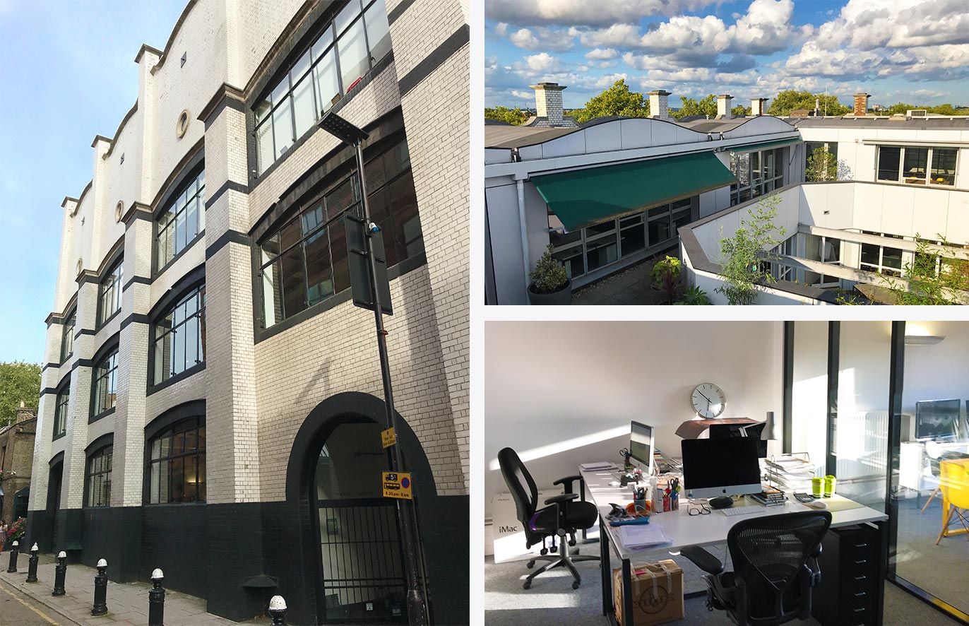
30 October 2019
Going up!
We’ve moved!
We can now be found at Voysey House just off Chiswick High Street (following in the footsteps of the legendary Turner Duckworth). We feel incredibly lucky to be situated on the top floor with not one but two roof terraces!
We’re also really pleased to move into a building with such rich history, (read on history buffs): The building was built as an extension for the Sanderson wallpaper company and was completed back in 1902, designed by Charles Voysey. The building is considered an important formative work in the evolution of the ‘Modern Movement’ in architecture, and is listed Grade II. Initially, it was known as White Building, referring to the white-glazed bricks that cover it.
We’re excited about the opportunities our new space offers. We love the space and love showing it off; so if you’re in the area pop in for a cuppa and a tour!
-
-
24 September 2019
Transform Awards North America Shortlist
We are delighted to be shortlisted for the Transform Awards North America. Our entry into the professional services category celebrates our brand refresh for Ayming in a competitive category.
We sit amongst some very talented peers, with Transform saying that the ‘shortlist is a group of agencies and companies that has set the standard for excellence in rebranding and brand development’. This was always going to be the case having been judged by industry leaders from Major League Soccer, Yale University, Pandora, SAP, Pernod Ricard and IBM.
Fingers crossed for November 7th, when the awards will be unveiled in an elegant penthouse on Fifth Avenue in New York!
To see our work for Ayming click here.
-
-
16 July 2019
Portugal dos Pequenitos
We are very excited to tell you we have a new international client! Portugal dos Pequenitos is a recreational and educational park created primarily for children to engage with the history and culture of Portugal in a fun and interactive way.
We have just returned from Portugal, where we received a very warm welcome from our hosts, looked around the historical and cultural garden in Coimbra and ran a brand strategy workshop; in what is the first step to refresh the brand identity of Portugal dos Pequenitos.
It was great to get to know the team over there! We are so proud to win the pitch and equally excited to work on the project. Watch this space!
-
-
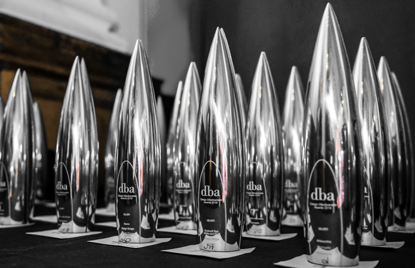
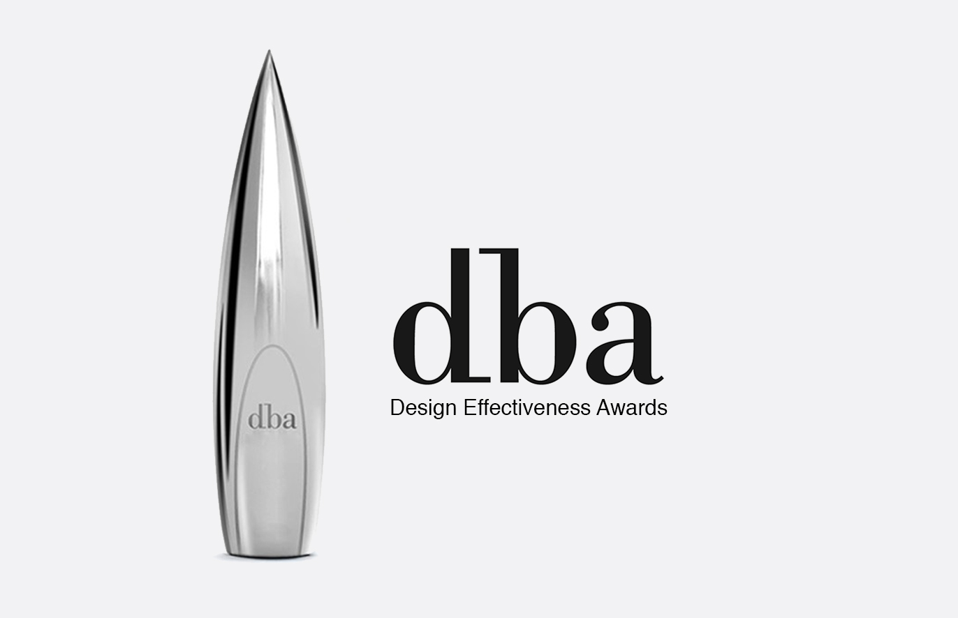
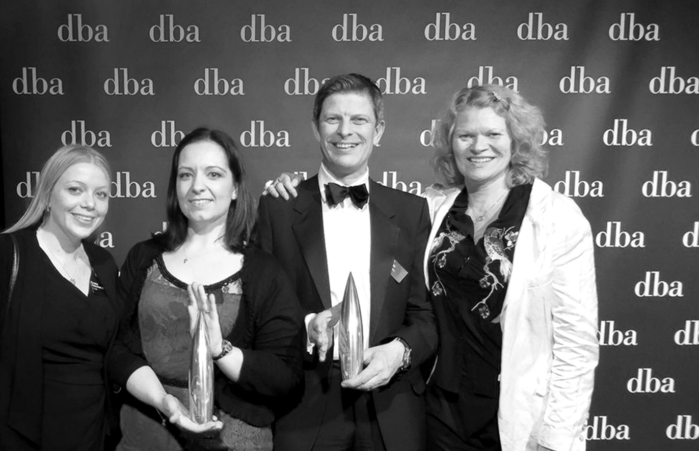
13 June 2019
DBA Bronze for Barwood Capital
We are thrilled to report that we have won a Bronze DBA Design Effectiveness Award! The awards are the benchmark for design effectiveness and focus on the difference design makes, which we are obviously very passionate about.
Barwood Capital is a real estate investment firm. Since our rebrand: their workforce has grown by 55%; its investor base has also swelled and the number of joint venture partners. New investors have increased 125%, with funds raised up 100% from £38 million for 2015 to £76 million for 2017.
It’s great to hear that these results have been recognised as a prime example of transformative brand design; proving design, when done right, can be a positive agent of change.
See our case study here.
(Photograph courtesy of Oleg at Event Photographer London)
-
-
28 May 2019
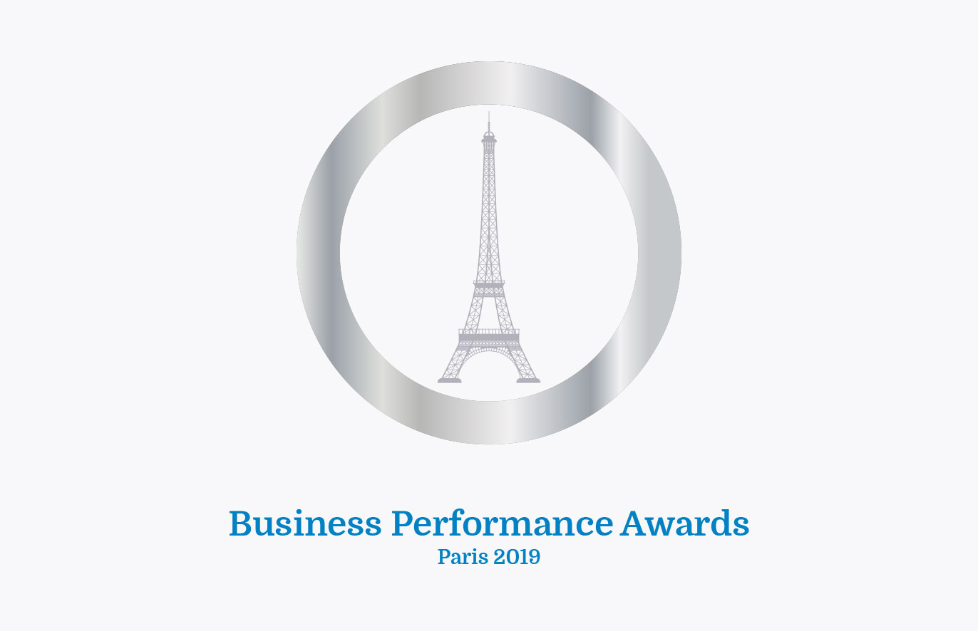
Ayming’s Business Performance Awards
We recently designed the event branding and invitations for Ayming’s annual Business Performance Awards. In the words of Ayming CEO, Hervé Amar the award programme, ‘highlights and rewards companies that have implemented innovative initiatives, delivered global results, and have opened the field of possibilities by driving performance where it is not expected’.
David was among the 1,000 attendees present at the Théâtre National de Chaillot (with a stunning view of the Eiffel Tower), and described it as an ‘honour to be in the company of some of Europe’s best and most innovative companies’. He also noted that it was, ‘great to see them playfully using their new branding!’
To see what else we have done for Ayming click here.
-
-
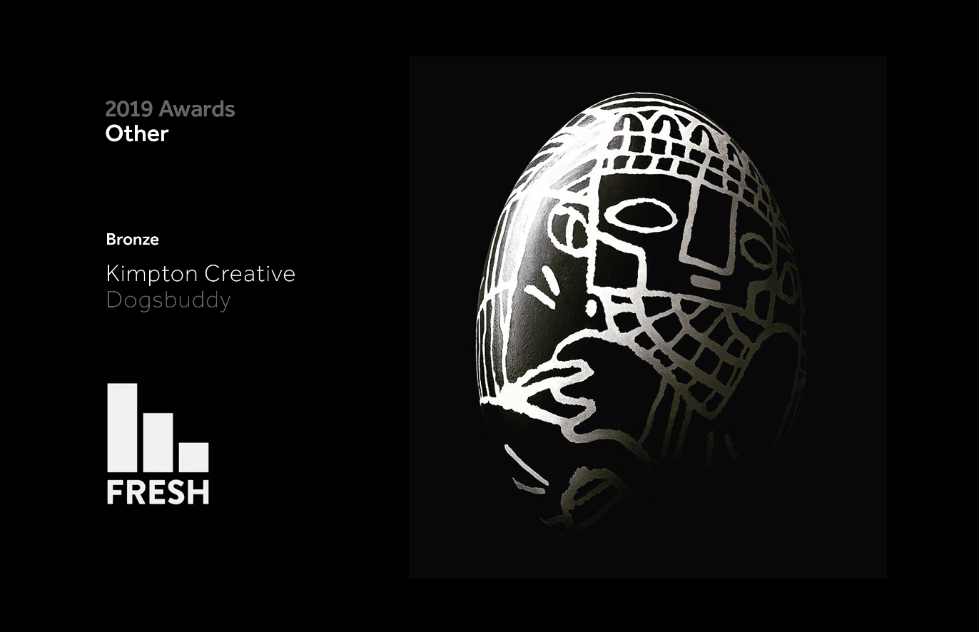
10 April 2019
Fresh off the press!
Our branded bones for Dogsbuddy have been awarded a Bronze at the Fresh Awards!
The project is difficult to categorise and the judges found the same thing, placing it in the ‘other’ category for ideas worthy of recognition that don’t easily fit in any of the other categories!
The awards ‘define the Freshest ideas and design in the industry’ and are ‘a barometer for future success.’
Apologies to the judges for our somewhat pongy entry!
To see the project go here.
-
-
2 April 2019
A healthy addition
We’re delighted to have added Wellpoint Group as a client.
They improve how organisations look after the welfare of their employees and have developed ‘the Wellpoint health kiosk’. This helps ‘provide easy and convenient access to health screening, removing traditional barriers and engaging individuals who rarely or never see a health professional. The kiosk gives them information, advice and guidance.’
Last month we helped create exhibition graphics and a sales brochure for a trade event at the NEC in Birmingham. The event was a great success for them and we understand Wellpoint have just landed a significant new client!
-
-
6 March 2019
DBA Award Winners!
The DBA Design Effectiveness Awards celebrate the difference that design can make to businesses. They showcase how powerful the partnership between clients and designers can be. They are judged on facts and evidence, (all entries are measured and verified). They are exceptionally hard to win.
Which is why we’re over the moon to share that our work for property investors, Barwood Capital has done just that! We look forward to finding out if we’ve won gold, silver or bronze at the award ceremony in June. Until then you can see our case study here.
-
-
28 February 2019
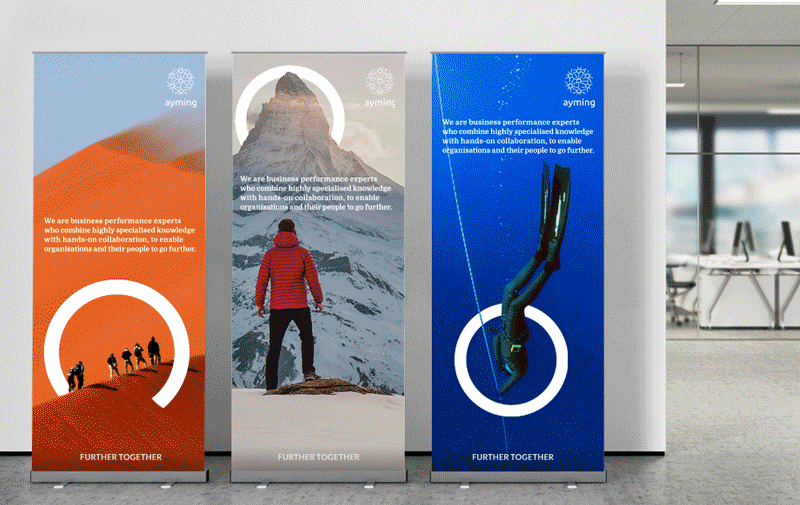
Ayming Further Together
We are proud to share our brand refresh for Ayming! They are business performance experts that have 30 years of experience specialising in improving their clients’ operational and financial performance. They came to us looking for a brand refresh and strategic direction to underpin it.
Our big idea for the brand came from a strategy workshop we led with key stakeholders within the business. From this we created their internal mantra, their core proposition: ‘Empower people to aim further together’. We also created an external strapline ‘Further together’, which expresses their culture and approach to working collaboratively with their clients. We brought this strategy to life by using circles (inherent in their logo) as a device to highlight and define destinations.
To see the full case study click here.
-
-
15 February 2019
Creating a powerful new brand for Innolith
We are proud to share our recent rebrand for Innolith. Their battery technology is a game-changing scientific breakthrough that delivers the world’s first safe Grid-Grade battery to power utilities. With variables such as growing energy demand, burgeoning electric vehicles and renewable energy generation, the power grid is under increasing strain. It is Innolith’s aim to manage and alleviate this pressure by fundamentally transforming the sector through safe energy storage.
Go here to see our full casestudy.
-
-
21 December 2018
Merry Christmas and a Happy New Year!
From all of us at Kimpton Creative we wish you a holiday season free of the ‘B’ word. Fingers crossed for a Prosperous New Year!
-
-
22 November 2018
An exciting new relationship
We are delighted to announce that we have been selected to work with Ayming on their brand identity refresh after an international pitch.
Ayming are a business consultancy that have 30 years of experience specialising in improving their clients’ operational and financial performance. They have 1,500 staff at offices in 16 countries around the world. We’ve enjoyed frequenting their beautiful offices in Central London (pictured) and Paris whilst getting to know them!
As we speak we are hard at work on the project but look forward to sharing this with you once it’s live early next year!
-
-
9 October 2018
Winner of an Early Transform Award!
We’re delighted to announce that Trevor Thompson, one of our design team has been awarded at the inaugural Transform ‘Young Contenders’ awards – one of only seven in the country. The awards are reserved for ‘the best and brightest and will be crucial to the success of the branding industry in the years to come.’
Our submission demonstrated Trevor’s talent and the impact he’s made for our clients and our business. With judges from Landor, FutureBrand, Pentagram and Superunion (to name a few), we’re even prouder he’s made it as one of the winners!
We look forward to hearing if he’s been awarded the ultimate prize of ‘Young Creative Brand Professional of the Year’ at the award ceremony on 28th November. (No pressure Trevor!)
-
-
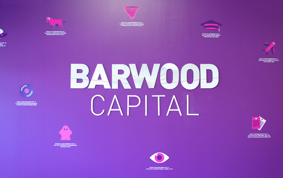
2 August 2018
Regional property experts move house
We’ve helped Barwood Capital make their new office space their own.
As you enter their reception area, a polished metal version of their logo is surrounded by little known facts about the the areas that they work in, (they are regional experts after all!) This ensures their clients have something to think about as they wait to be greeted.
We’ve also created external signage and frosting for their meeting rooms, which can be viewed in our updated case study here.
We’re currently working on a really exciting project with Barwood Capital that we hope to be able to show you in the Autumn.
-
-
23 July 2018
Innolith
We’re delighted to be working with a new client; Innolith Battery Technology is a game-changing scientific breakthrough that delivers the world’s first safe Grid-Grade battery to power utilities.
With evolving technologies and renewable energy, the power grid will be under increasing strain. It is Innolith’s aim to alleviate this pressure and fundamentally transform the sector.
Innolith have developed the first inorganic battery that solves the longstanding issues of all lithium batteries – safety and charging cycles.
Our identity uses ‘the grid’ and reflects their core proposition ‘Keeping the lights on around the world’. We’re currently designing their website and the signage for their buildings in Switzerland and Germany. We look forward to sharing these in due course.
It’s very exciting to be involved with what could be a paradigm shift in people’s lives.
-
-
25 June 2018
PMA Award Winners!
We are proud, whilst pleasantly shocked, to announce that last week we won the ‘Best Marketing Campaign for a London Office’ category at the Property Marketing Awards.
The Judges commended our ability to create a successful ‘cost-effective’ campaign that convinced ‘potential tenants that Paddington is a thriving area with plenty to offer workers.’ Whilst also praising our ability to ‘lay out a clear and compelling story for the agents to tell’ about Paddington, an area undergoing transformation.
As if that wasn’t enough, it was also lovely to be presented the award by BBC newsreader Sophie Raworth!
See the full identity and campaign here.
-
-
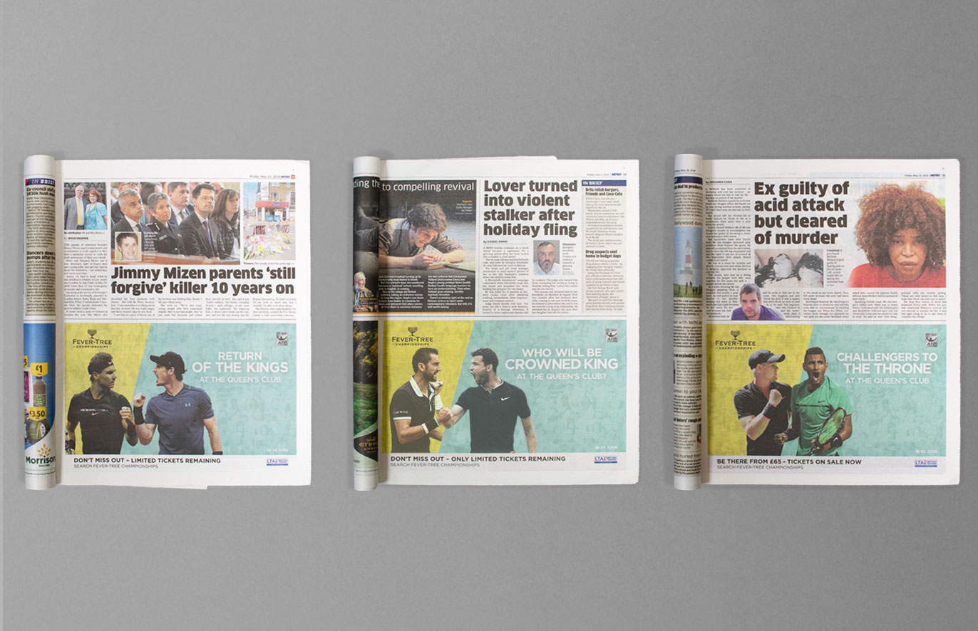
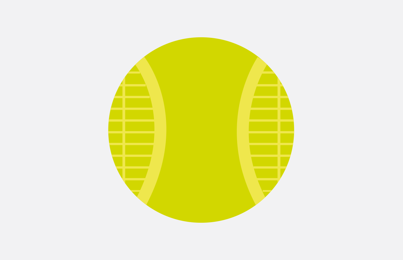
12 June 2018
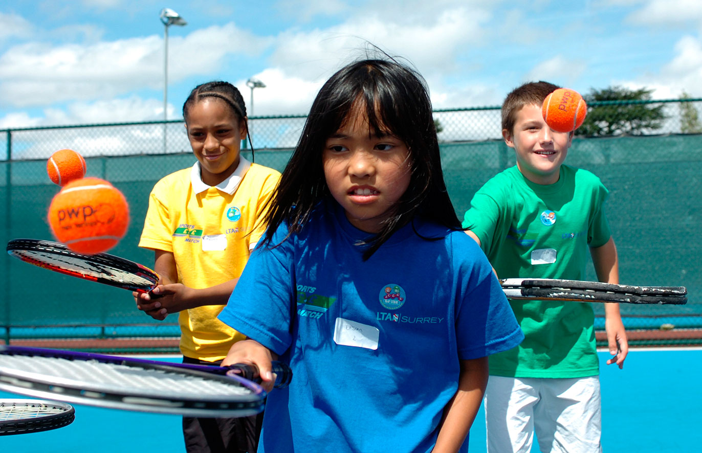
Crowning Glory
The Fever-Tree Championships is an annual event on the men’s professional ATP World Tour, held at The Queen’s Club. The LTA approached us to help them advertise in the Evening Standard and Metro.
Using the tournament graphics, we came up with a royal messaging theme (it’s Queen’s after all) and coupled this with competitive images of some of the best players attending.
To see who will crowned the King of Queen’s Club go here, to get the last few remaining tickets while you can.
Fingers crossed Murray makes it!
-
-
8 June 2018
Design Week Award Shortlisting
We are proud (and pleasantly surprised) that our dog bones for Dogsbuddy have been shortlisted at the Design Week Awards in the Print Communications.
The Design Week Awards pride themselves on awarding only the very best examples of design excellence and innovation.
We’re up against some incredible entries (naturally), but we’ll have our fingers crossed to hear the results on 26th June!
-
-
17 May 2018
PMA Shorlisting
We are pleased to announce that our work for The Point in Paddington has been shortlisted in this years Property Marketing Awards. We are nominated in the ‘Best Marketing Campaign for London Offices’.
The awards celebrate the ‘year’s most effective, innovative and creative marketing campaigns around the UK property industry’. We are proud to hear that all entries were judged rigorously by a panel made up of marketing professionals at the top of their fields.
We look forward to the award ceremony on 20th June, hosted by BBC newsreader and presenter Sophie Raworth!
-
-
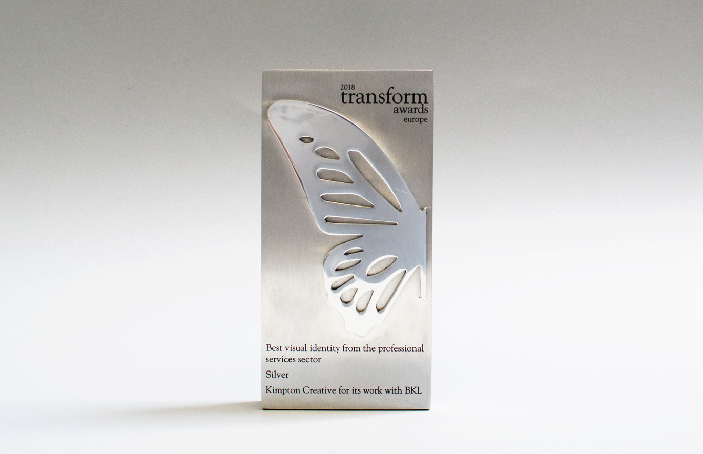
27 March 2018
Transform Award Success
Last night our work for BKL was awarded Silver in a very competitive professional services category.
Established in 2009, the Transform Awards has evolved into a celebration of the indispensable talent that exists within the branding sphere.
The implementation, positioning and creativity of the corporate brand is becoming an increasingly treasured business asset. The Transform Awards evaluate exemplary work in brand development, and acknowledge the growing significance of brand in strategic corporate communications – developing and sustaining a strong brand is imperative for success.
Following the most successful year on record for both Transform magazine and the Transform Awards, the 2018 Transform Europe awards celebrated outstanding branding and rebranding projects from the UK and Continental Europe. The awards consistently set a stronger benchmark for work in brand development while reflecting the growing significance of brand in strategic corporate communications. The corporate brand – and its implementation, positioning and creativity – has become one of the most valuable assets a business owns.
Andrew Thomas, publishing editor at Transform magazine, says, “Each brand that has been involved in this year’s awards, global or local, has demonstrated outstanding creative ability and strategic thought while working closely and collaborating with their agencies.”
Thanks to all involved and congratulations to all the other winners.
-
-
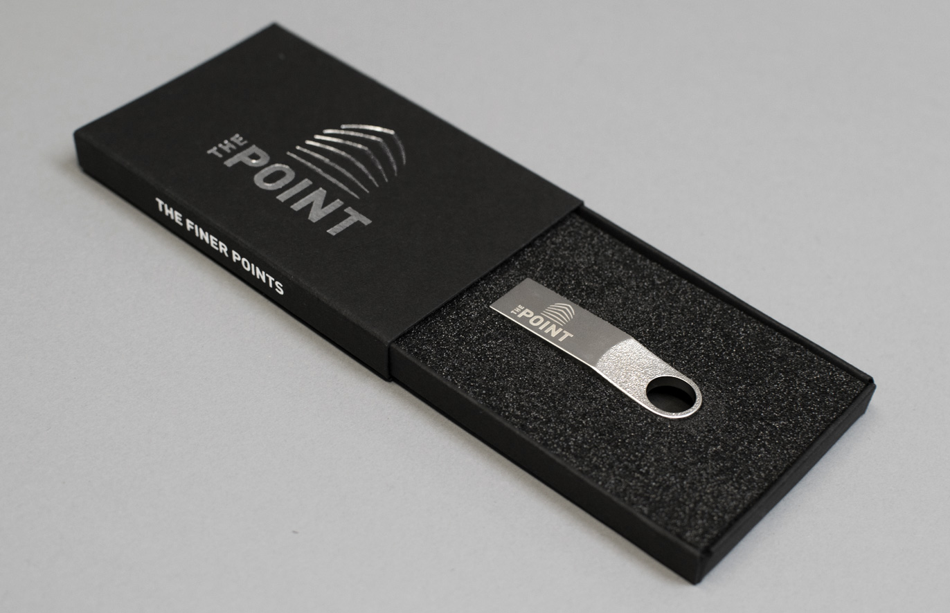
21 March 2018
The Finer Points
We have recently helped our friends at The Point. At their breakfast launch event, guests were given all the latest property details on a branded usb stick, housed in a specially made usb box.
The quality feel of both the usb and box is key to their ‘keep ability’ and reflective of the quality of the office space in question.
-
-
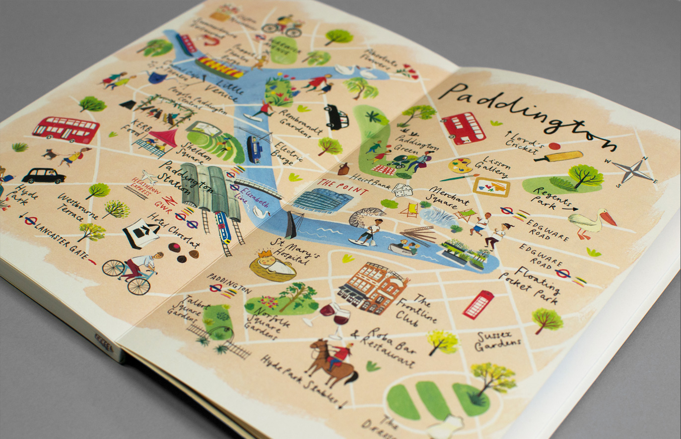
13 March 2018
Paddington’s Points of Interest
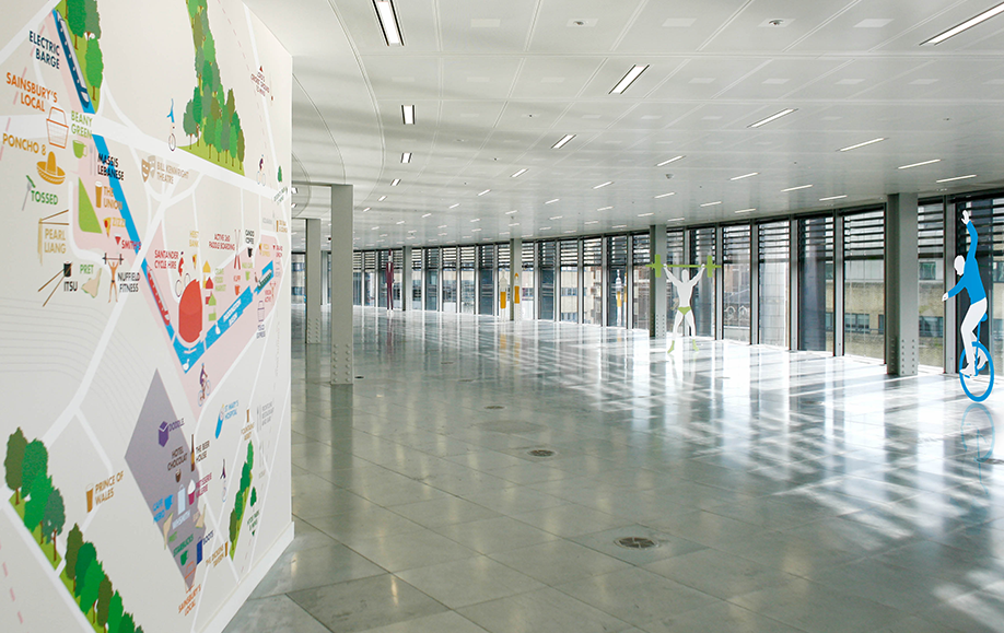
We are pleased to share our latest work for The Point in Paddington!
We have created a bespoke, debossed Moleskine notebook to help agents sell the busy and exciting area that Paddington is.
It was a joy to work with illustrator Clair Rossiter who beautifully brought the area map to life.
Click here to see our updated case study.
-
-
2 March 2018
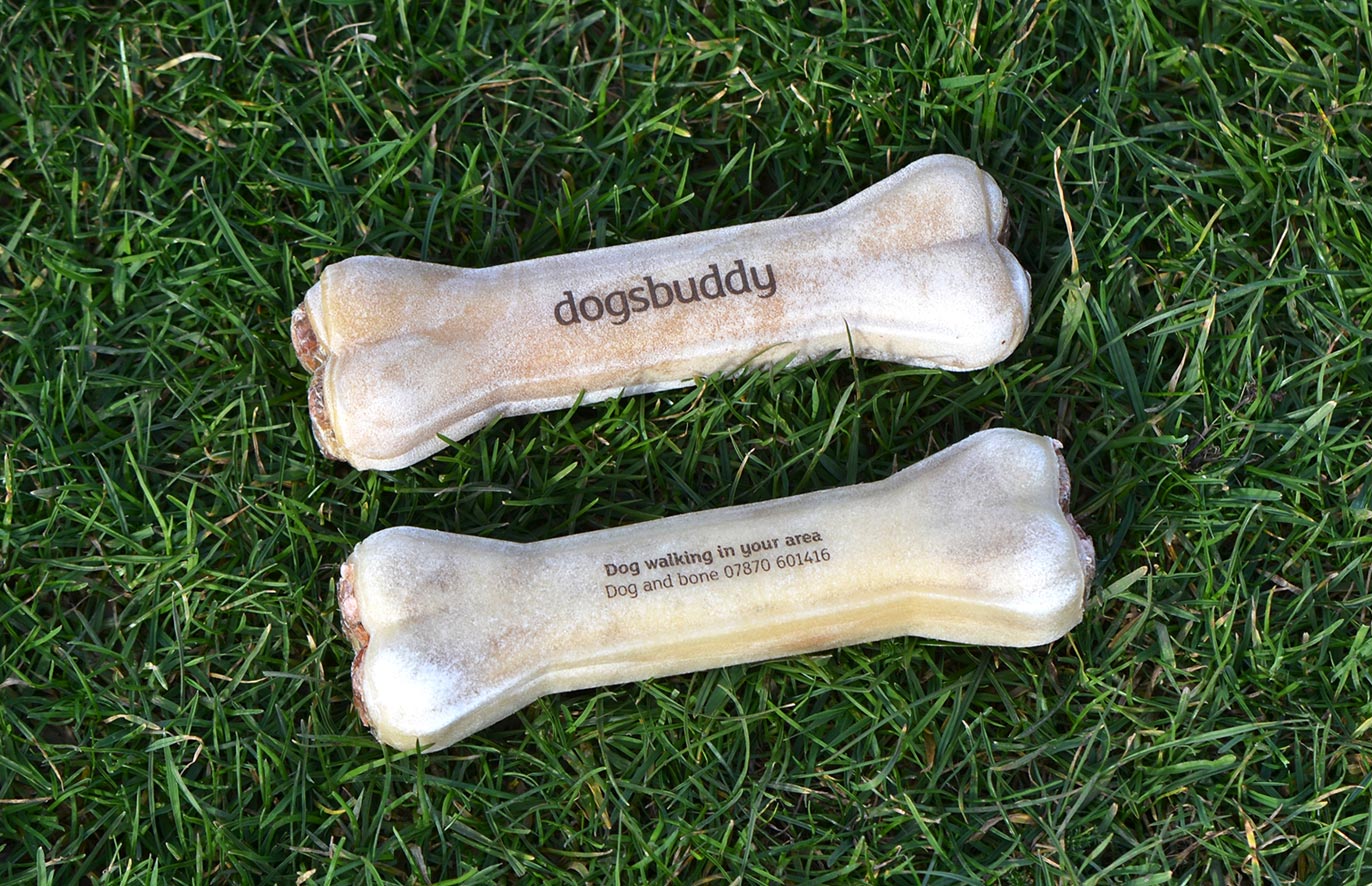
Dog and bone
Back in 2013 we branded Dogsbuddy, a dog walking and dog boarding service in SE London. In late 2017 they came to us with a problem: How can we raise our profile locally and gain more clients?
Dogsbuddy put the happiness of the dogs they care for at the heart of all they do. This led to our idea of making dogs happy as part of our solution. By leaving Dogsbuddy branded dog bones in places that people take their dogs, the dog retrieves the bone and brings it to the attention of their owner, thereby recommending Dogsbuddy.
The printer told us that ‘pad printing’ with edible ink was the best way to achieve our desired result – which we thought was rather appropriate!
So if you’re based in South East London and in need of a dog walker; get on the dog and bone!
-
-
2 March 2018
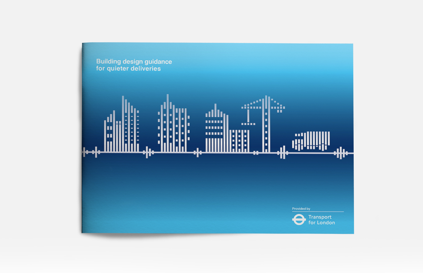
TFL Quieter Deliveries
We love it when people like our work and we love it even more when they recommend our services to their clients. We were lucky enough for this to happen when our friends at Temple Group put us forward for an exciting project with TfL.
The project is effectively a white paper on the measures that can be taken to redesign cities to ensure that deliveries are quieter. We used sound bars as a way to illustrate iconography throughout the document.
-
-
2 February 2018
WLBA Winners!
We are proud to be able to announce that last night we won ‘Creative Business of the Year’ at the West London Business Awards,
The judges commented: “They impressed with their inventive and tenacious approach to winning business and delivering for their clients, who range from Bupa to builders to banks. Kimpton Creative has more than trebled their number of projects in the past year.”
The awards were held at Wembley Stadium and presented by Paralympic superstar Dame Tanni Grey-Thompson.
-
-
15 January 2018
Transform Awards shortlisting
We’re very pleased to share that we’ve been shortlisted for this year’s Transform Awards. This was made even more impressive when we were told that this has been the most competitive year for the award scheme to date!
Our fingers are crossed for our rebrand of BKL in the ‘Best Visual Identity from the Professional Services’ category. We hope we’re able to match our gold award winning entry for Purcell in the same category in 2016!
Congratulations to everyone lucky enough to be shortlisted, we look forward to seeing you in March!
-
-
12 December 2017
Temple 20th Anniversary Book
We are proud to have just helped Temple Group celebrate their 20th anniversary with a book that looks back on where they started (the Chair and Founder’s dining room table) and the onward journey to becoming leading consultants in the environmental, planning and sustainability sectors.
A notable feature of the book was the throw-out timeline that highlighted key moments across the last 20 years.
-
-
6 December 2017
Dinner time!
We’re delighted to have been shortlisted in the creative business category at the West London Business Awards.
This is the second year running that we have been nominated, so perhaps we’ll go a step further this time and win!
The West London Business Annual Awards showcase business excellence in West London around three themes: ‘Sector leadership’, ‘Sustainable & responsible business’ and ‘Economic growth’.
-
-
10 October 2017
Growing awareness of mental health in the workplace for Bupa
Continuing our relationship with Bupa, we’ve just completed a guide to help advise managers how best to address mental health in the workplace. This is being launched today as it is World Mental Health Day.
One of the things that we’ve taken away from Bupa’s guidance is that mental health is something we all have. You can have good and bad physical health and the same is true of mental health.
Another is that one in six people experience a common mental health issue at any one time. So for anyone facing mental health issues the most important thing to remember is that you are not alone, and talking about it is the first step to regaining a good mental health.
-
-
24 September 2017
Building Brighter Futures with BKL
Having recently rebranded BKL we have just completed their new recruitment brochure. The brochure builds on our previous work for them, bringing to life the ‘Build bright’ proposition in a relevant way to entice bright and like-minded people to join the ranks. We were involved in the entire brochure from ideas, layout and for the copy we collaborated with our good friend Scott Perry, The Bard of Bray.
-
-
30 June 2017
BKL
We have just completed the rebrand of BKL, an accountancy firm based in London and Cambridge.
We established their brand strategy before creating their identity, which centres around ‘Build Bright’ – a phrase referencing how they build bright ideas, relationships and futures.
See the case study here.
-
-
15 June 2017
SimpsonHaugh
Continuing our work in the property sector and more particularly architects, we have refreshed the SimpsonHaugh brand, defining their brand strategy and creating a new structural logo and morphing pattern in a suite of orange colours. See the case study here.
-
-
20 May 2017
Bupa
We’re delighted to have started working with Bupa, creating a guide book for the ‘imperfect parent’, a helpful set of tips for parents who worry that they are getting things wrong (that’ll be all of us!).
This was used for the United Nations’ International Day of Families on 15th May.
-
-
8 May 2017
A new addition
We’re delighted to welcome Trevor Thompson to our team as a designer. He was previously a designer at The Allotment.
-
-
26 January 2017
UK Green Building Council go ahead
We are delighted to announce that we are about to start working with the UK Green Building Council, a charity and an industry-led network working to improve the sustainability of the built environment.
This is especially exciting for us as we are members of the organisation and this is an area that is close to our hearts. We are looking forward to starting the project!
-
-
20 December 2016
Kimpton Christmas message
Merry Christmas and a Happy New Year from all of us at Kimpton Creative!
-
16 December 2016
SOS deforestation gif
We have created another initiative for the Sumatran Orangutan Society, an organisation that works to protect critically endangered Orangutans in Sumatra. We created an animation that highlights the correlation between deforestation and the plight of Orangutans.
To see the great work SOS do, please visit their website.
-
-
24 November 2016
West London Business Awards shortlisting
We’ve been shortlisted for another award at the West London Business Awards in the Creative and Media agency of the year category! Fingers crossed that we can add to our haul of awards this year!
-
-
27 October 2016
The Point property marketing campaign
We’ve installed the campaign graphics as part of our property marketing campaign for The Point, a commercial office building owned by developer Tishman Speyer. We used stylised illustrations centering around people, presented in a colourful and fun illustration style to highlight the amenities, activities and history of the area, a key requirement of the brief.
Click here to view the full case case study.
-
-
7 October 2016
Barwood identity launch
We’ve launched the new identity for Barwood Group, a Northampton based property group with three separate businesses: Barwood Land, Barwood Homes and Barwood Capital. We created a new set of logos featuring glowing lines emanating from the centre and used large glowing type throughout the identity for key messages to emphasise their core proposition – enriching. We then designed a suite of websites to sit together and completed a substantial amount of collateral for the different sectors of the business including: brochures, manuals, signage, signatures and stationery.
Click here to view the case study.
-
-
27 September 2016
Transform Tuesdays
Kimpton Creative have been featured twice in Transform Magazine’s ‘Transform Tuesday’ column. Every week the column examines new brands and rebrands and have featured our work on on the rebrand of Potential Plus International and Freedom Capital.
Find the link to the Transform Tuesday section for Potential Plus here and Freedom Capital here.
-
-
28 June 2016
Property Marketing Awards shortlisting
We were shortlisted as one of the three finalists at this year’s Property Marketing Awards for the Best Marketing Campaign for a London Office. The shortlisting was for our work on Verde SW1, a commercial redevelopment in Victoria for developer Tishman Speyer. We had a great night at the PMA ceremony and a big congratulations to all the winners!
-
-
14 June 2016
New relationship
We’re pleased to announce that we have started working with SimpsonHaugh and Partners to evolve their brand identity. The architectural practice was founded in 1987 and continue to win many awards for their buildings and projects. Their current projects include Phase 1 of the Battersea Power Station and landmark building 1 Blackfriars. They rank in the AJ120 as one of the largest and most influential architecture practices in the UK.
-
-
25 May 2016
Potential Plus International identity launch
We’ve just completed a full identity for Potential Plus International, a leadership development consultancy who work with global organisations. We’ve designed a logo, collateral and a fully responsive website which has just been launched.
-
-
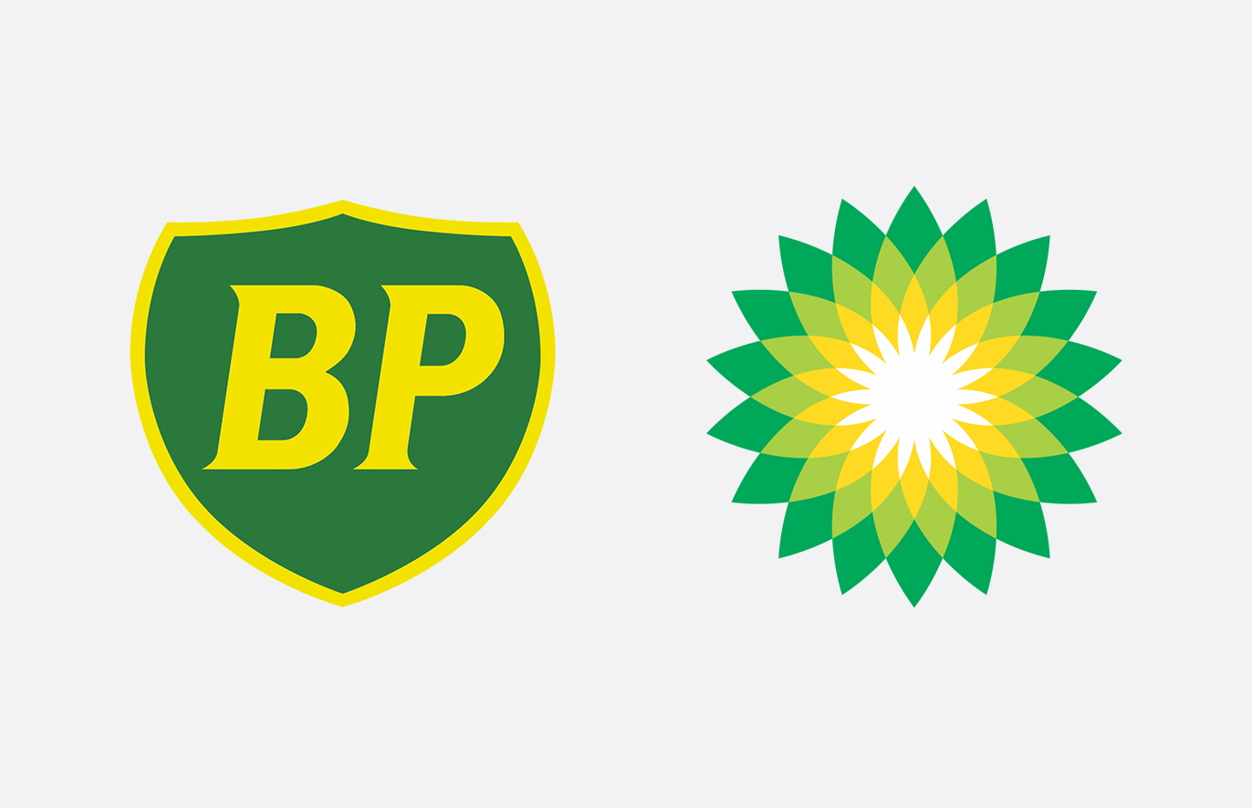
21 May 2016
Vox Pop for Design Week
Our Creative Director David Kimpton has been featured in another vox pop for Design Week. This time he shares his opinion on logo modernisation and the newest rendition of the BP logo under the title of: ‘Designers tell us how to modernise logos but keep authenticity’.
You can read the full article here.
-
-
13 May 2016
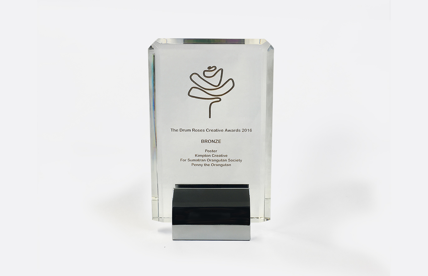
Roses Award
Continuing a great year for Kimpton Creative, we’ve won a bronze Roses creative award for our Penny the Orangutan poster. A coin mosaic art piece to highlight the importance of donations of all sizes for the Sumatran Orangutan Society, an organisation that works to protect critically endangered Orangutans in Sumatra.
See the full case study here.
-
-
12 May 2016
Barwood project win
We’re delighted to announce we’ve won a three way pitch to work on the rebrand of the Barwood Group. They are a Northampton based property group with three separate businesses: Barwood Land, Barwood Homes and Barwood Capital. We’re excited to be working with a new property client and are looking forward to starting the project!
-
-
5 May 2016
Published RIBA article
Our Creative Director David Kimpton has written an article about the importance of a strong brand identity for architectural practices for the RIBA Journal Magazine. The article is entitled ‘You’re more than just a business… you’re a brand’ where the process that we go through when creating a brand identity as well as highlighting results by showing our award-winning rebrand for architects Purcell, their turnover grew by £3.27 million in the two years following the rebrand.
You can read the full article here. You can also see the full Purcell brand identity case study here.
-
-
23 April 2016
Design on point: D&AD Pencil win!
We’ve won a D&AD pencil award for our Penny the Orangutan poster in the Graphic Design Poster category! The work is for the Sumatran Orangutan Society, a organisation that works to protect critically endangered Orangutans in Sumatra. The poster is taken from an art piece of a coin mosaic to highlight the importance of donations of all sizes. We’ll find out what kind of pencil we’ll win very soon!
See the full case study here.
-
-
5 April 2016
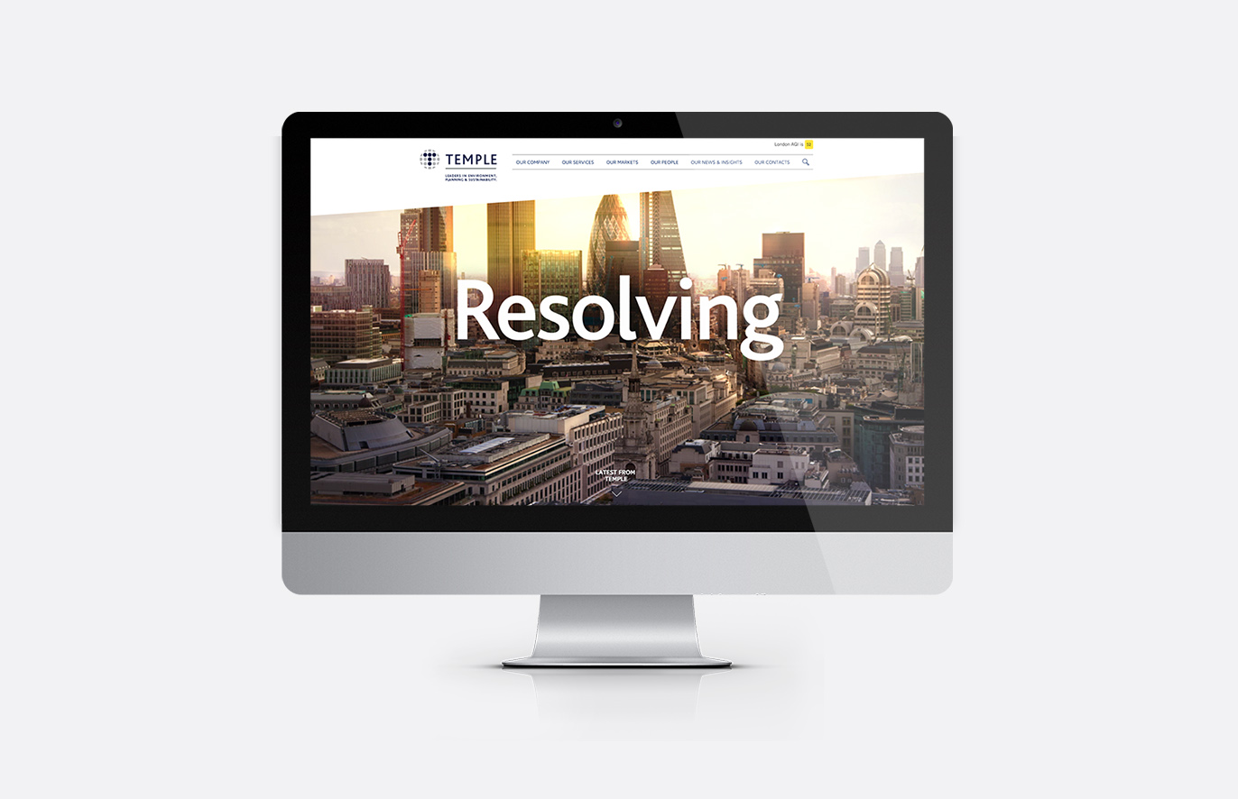
Temple Group website
We’ve launched a website for Temple Group, a leading environmental, planning and sustainability consultancy. We’ve created a fully responsive website featuring large animated panels and dynamic typography. The Temple group are an organisation who have been consultants for some of the UK’s most important infrastructure and property projects such as Crossrail, LOCIP, HS2 and The Shard. We’ve already had some great feedback.
To see the video headers in action on their website please click here.
-
-
23 March 2016
Gold!
On top of winning Silver at DBA design effectiveness award last month, we’re thrilled to announce a Gold at the Transform awards for our rebrand of Purcell! To view the Purcell case study please click here.
-
-
12 February 2016
Silver!
We are delighted to announce that we have won a silver award at the Design Business Association’s Design Effectiveness Awards 2016! Our entry was for the rebrand of Purcell, a top 10 UK architectural practice. It led to a 29.5% increase in turnover over two years.
We collected our award with the client at the star studded awards ceremony last night at Tobacco Dock.
The DBA’s Design Effectiveness Awards champion the role of effective design in the creation of business growth. They showcase the very best partnerships between business and agencies.
We are extremely pleased to be recognised for this award after all the hard work that we put in and now have to find a suitable shelf to keep it on!
-
-
18 January 2016
Transform Awards Europe
We are thrilled to announce that we have been shortlisted for another award! This time at the Transform Awards Europe 2016 in the category for the best visual identity for a professional services company.
Our entry was for the rebrand of Purcell, a top 10 UK architectural practice.
The Transform Awards Europe recognise best practice in corporate, product and global brand development work, with categories that focus on strategy, execution, content and evaluation.
The award will be presented at an awards dinner in March. To view the Purcell case study please click here.
-
-
11 January 2016
The SOS running vest
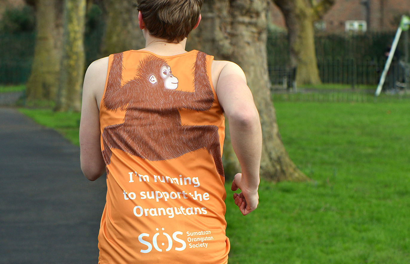
Continuing our relationship with the Sumatran Orangutan Society we’ve just designed a running vest for them. Fundraisers will be running for SOS in several events this year, including the London Marathon, to raise money for the plight of orangutans. We illustrated a young orangutan clinging to the back of the bright orange vest with the phrase: ‘I’m running to support the Orangutans’.
Look out for them in the Marathon in April!
-
-
18 December 2015
Temple website win
We’re delighted to have won a pitch to design the website for Temple Group, a leading environmental, planning and sustainability consultancy. We’re excited to be involved with an organisation who have been consultants for some of the UK’s most important infrastructure and property projects such as Crossrail, LOCIP, HS2 and The Shard.
-
-
11 November 2015
DBA Design Effectiveness Award
We are delighted to announce that we have won an award at the Design Business Association (DBA) Design Effectiveness Awards 2016.
Our entry was for the rebrand of Purcell, a top 10 UK architectural practice.
The DBA’s Design Effectiveness Awards champion the role of effective design in the creation of business growth. They showcase the very best partnerships between business and agencies; the very best innovation; the very best application of design.
What’s also special about these awards is that they are judged by business leaders. This year the judges included senior business figures from companies such as British Airways, Channel Four, Coca Cola, Innocent, LEGO, Macmillan and Procter & Gamble.
The award, be it bronze, silver or gold, will be presented at an awards dinner in February 2016. To view the Purcell case study please click here.
-
-
23 October 2015
Property insights
We’re pleased to announce that we’ve added a new section to our website entitled ‘Property Insights’.
We have been working with developers and agents in the property sector (across commercial, retail and residential) for over 10 years, and have developed a keen understanding of what makes it tick and where design can contribute.
Creative Director David Kimpton will be sharing some of our experiences of working with the property sector as well as insights and ideas about the key trends and the relationship to design and marketing. Our first article is about wellbeing and is live now.
You are welcome to join the debate on our Linkedin group where we encourage discussions from peers in the property industry or head over to our Property Insights section to read the first article.
-
-
19 October 2015
Change the world
We have just finished creating a coin mosaic for the Sumatran Orangutan Society, an organisation that works to protect critically endangered Sumatran Orangutans.
We suggested creating an art piece to sell at a charity auction, highlighting the importance of donations of all sizes and the difference just a few pennies can make!To read the full case study and watch a video of the making click here
-
-
15 September 2015
As free as a bird…
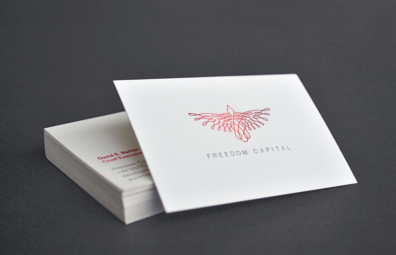
We are delighted to announce we are working on a new branding project for West London based Freedom Capital.
Freedom Capital are a high end property company focusing on the redevelopment of properties and investment.
The identity borrows from the financial language of security marks.
We are currently designing a website that will be launched in the coming weeks. Full case study here.
-
-
14 August 2015
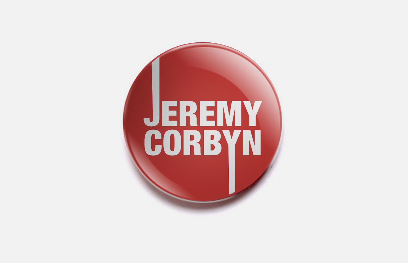
Would you vote for this logo?
Our Creative Director David Kimpton has been featured in an interview on Design Week giving his opinion on Jeremy Corbyn’s political logo.
You can read the full article here. -
-
24 July 2015
Ex Libris
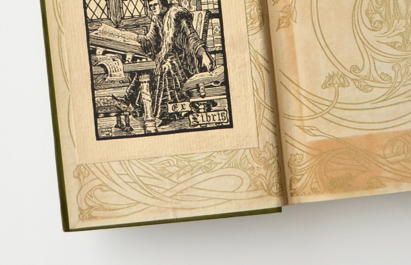
We have just designed a brand identity and website for an initiative by literary agents Peters Fraser & Dunlop. The website which has just been launched, specifically helps provide information and guidance to literary executors; individuals who become responsible for the literary estate of an author post-mortem.Currently there is very little information out there for those who are suddenly handed responsibility for something they will very likely know nothing about and this website aims to help solve that by providing a helpful information resource.
You can see the full project here here.
-
-
16 June 2015
Suite spot
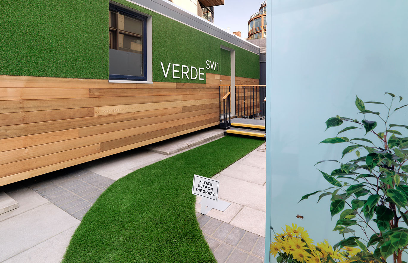
Kimpton Creative have recently delivered a marketing suite that we designed for Verde SW1, a 282,000 sq ft commercial redevelopment in Victoria. We covered the exterior in artificial grass and wood panelling, referencing our campaign’s ‘Office/Garden’ theme and even affixed a 10ft flower lamp on to the roof! The interior features hanging flower lamp shades and leaf clock hands, continuing the theme.
To read the full case study and see the flower lamp please click here.
-
-
7 May 2015
Ticking boxes
David Kimpton our creative director has been featured in Design Week’s article about political party branding!
Click here to read the article.
-
-
17 April 2015
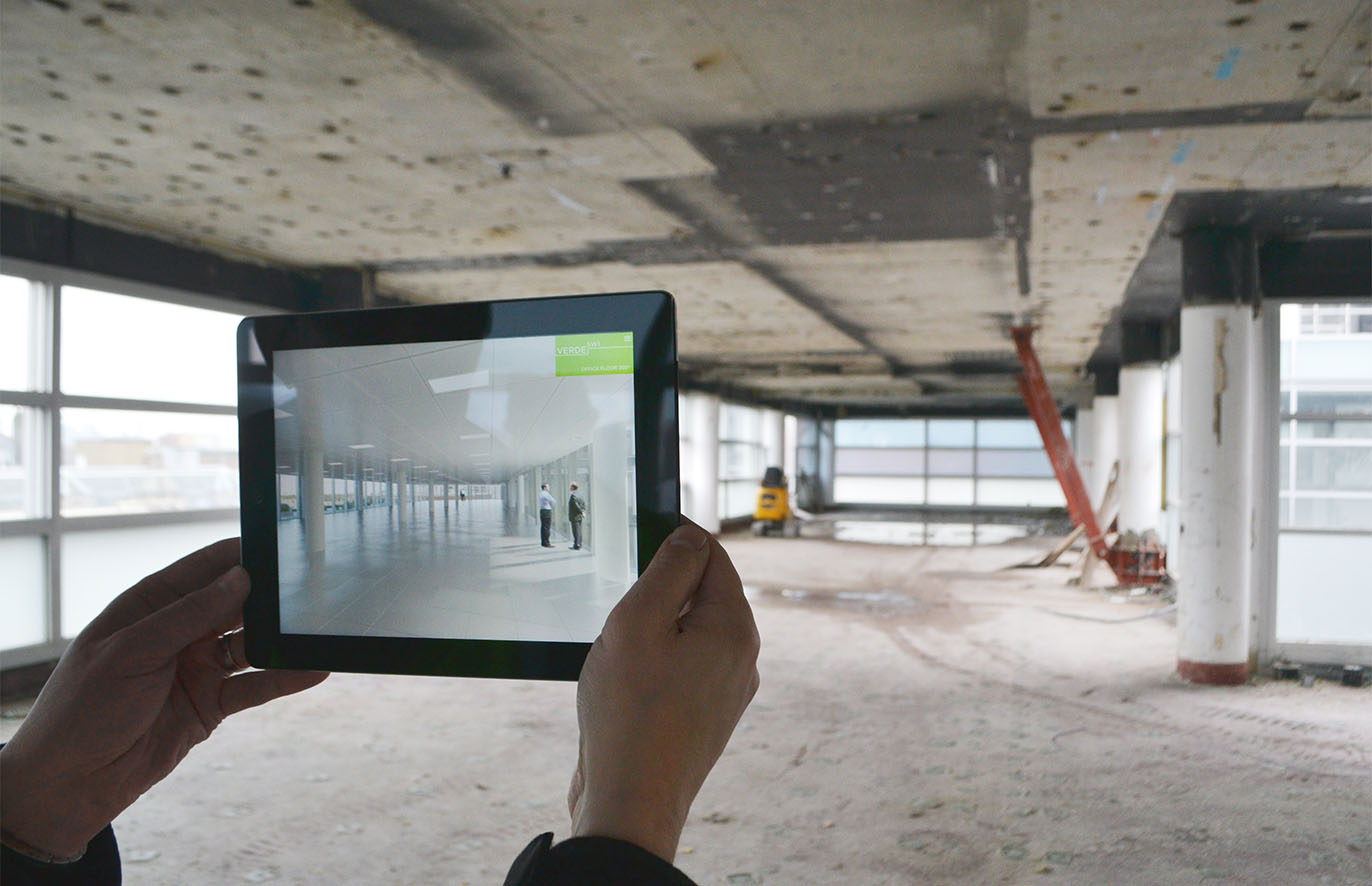
Verde Interactive App
Kimpton Creative have designed an interactive app for the agents of commercial development Verde SW1 to present to prospective tenants. This app contains films, interactive maps, plans, photos and CGIs.
The greatest feature is the creation of a tool for agents to be able to stand in a space and show prospective clients exactly how their office floor would look. Using compass mapping, the tablet screen mirrors the surrounding space as a CGI in a fully responsive 360º view. This can even include different furniture configurations at the press of a button!
Read our full insight article here.
-
-
31 March 2015
Ape-ril buffoonery!
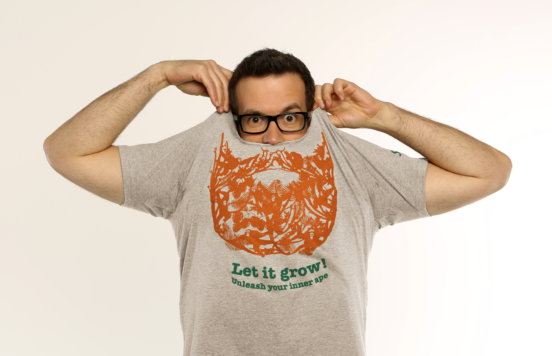
We have just helped launch the latest fundraising campaign from SOS, an organisation that works to protect the critically endangered Sumatran Orangutans and prevent them from becoming the first Great Ape species to become extinct.
The campaign named Ape-ril encourages people (throughout the month of April) to do what all male apes can do and grow a beard. We created a central graphic of a jungle scene filled with Orangutans that from a distance forms the shape of a thick glorious beard.
Visit the campaign site here.
-
-
11 February 2015
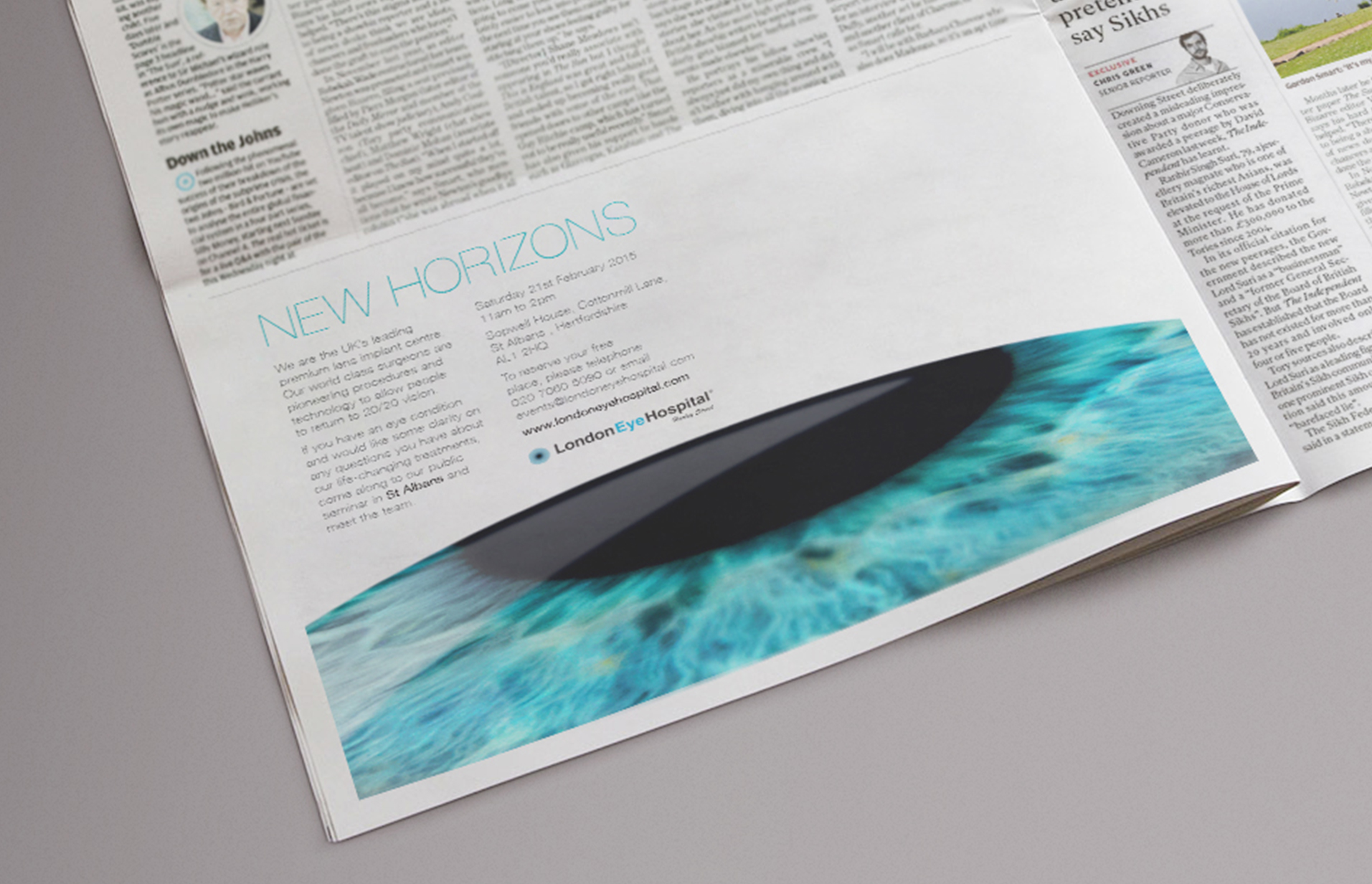
New horizons
Kimpton Creative has begun working with Harley Street’s prestigious London Eye Hospital.
Their world class surgeons are pioneering procedures and technology to allow people to return to 20/20 vision, a life-changing event from which the idea came.
The advert will prompt potential customers with an eye condition to attend a primary consultation meeting to get clarity on any questions they have about the treatments. It will feature in local magazines and newspapers across the UK.
Keep an eye out for it!
-
-
19 December 2014
Seasons greetings from Kimpton Creative
A projected animation onto the windows of our new studio at Kimpton Creative. The secret to hitting our Christmas deadlines!
Merry Christmas!
-
1 December 2014
Flick book moving card
To go with our ‘moving’ animation (see post below), we decided to make a flick book to give people something tangible to mark the occasion of our studio move. The ‘moving’ animation lends itself naturally to the flick book, which we sent out to clients and friends to make them aware of our new address.
-
31 October 2014
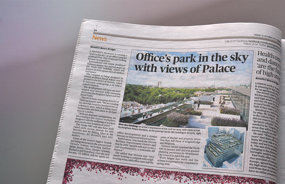
Verde SW1 makes headlines
The marketing of Verde SW1 has started in earnest, with an article appearing in today’s Evening Standard.
See the online article here.
-
-
29 October 2014
Bringing the outside in…
We have just launched the first phase of a property marketing campaign to promote Tishman Speyer’s 282,000 sq ft office redevelopment in Victoria, Verde SW1.
We created a new name, identity and a marketing campaign for the building, to promote its key selling points to potential tenants.
A rigorous workshop established the core proposition, ‘dramatic gardens with views’, putting the six enormous roof gardens at the centre of the building’s ethos. This led to the name, Verde SW1, which references the green gardens and lush surroundings.
Our idea was built around this key theme, featuring office and garden combinations to highlight the main messages in a striking and fresh way. These are used on the website, a brochure and hoardings to provide a clear and distinctive campaign, maintaining a consistent vibrant message and tone throughout.
A marketing suite, interactive sales app and advertising are in the pipeline.
See the website here.
-
-
27 October 2014
Reopening a door…
Continuing our fantastic relationship with Purcell, a top 20 UK architects’ practice with 17 offices around the UK and Hong Kong, we have recently been reviewing the Purcell brand identity which we created in 2012.
This process involved reviewing the collateral produced over the last two years, inviting feedback from the offices, talking to clients and visiting some of the offices.
The resulting feedback has led to a strategic exercise to refine their offer. We are also tightening up their bid and submission documents, making improvements to the website and creating guidelines for more on-brand office interiors.
-
-
17 September 2014
On the move
We have just moved into our new studio in Chiswick. An exciting phase in our development as we grow to meet client needs and expand as a team.
If we had a cat, we’d be able to swing it!
Be sure to update your records with our new contact details. And don’t be a stranger.
Kimpton Creative
2 Sutton Court Road
London W4 4NFT +44 (0)20 8994 0907
-
-
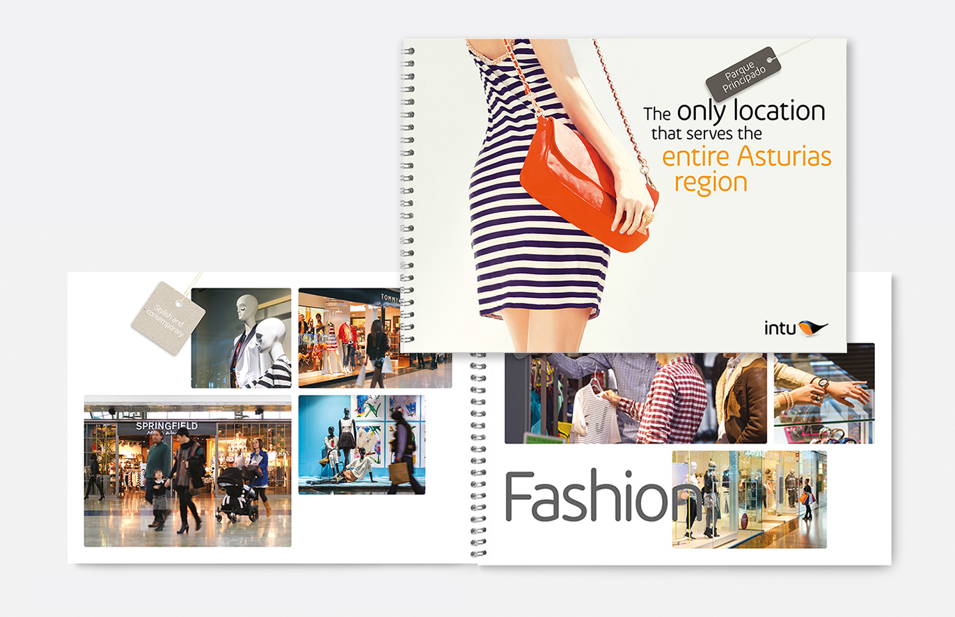
14 July 2014
In fashion – B2B brochure
We have been busy developing a B2B brochure for a shopping centre in Spain on behalf of intu, owners of Lakeside Thurrock and the Trafford Centre Manchester among others. Our idea appropriates clothing tags to help focus on the fantastic fashion offer present at the centre in Oviedo, Spain.
-
-
22 May 2014
Vox pop
Our founder and creative director David Kimpton was asked by Design Week to respond to the question: “What was the scariest thing you had to do at the start of your career?” this is what he wrote.
-
-
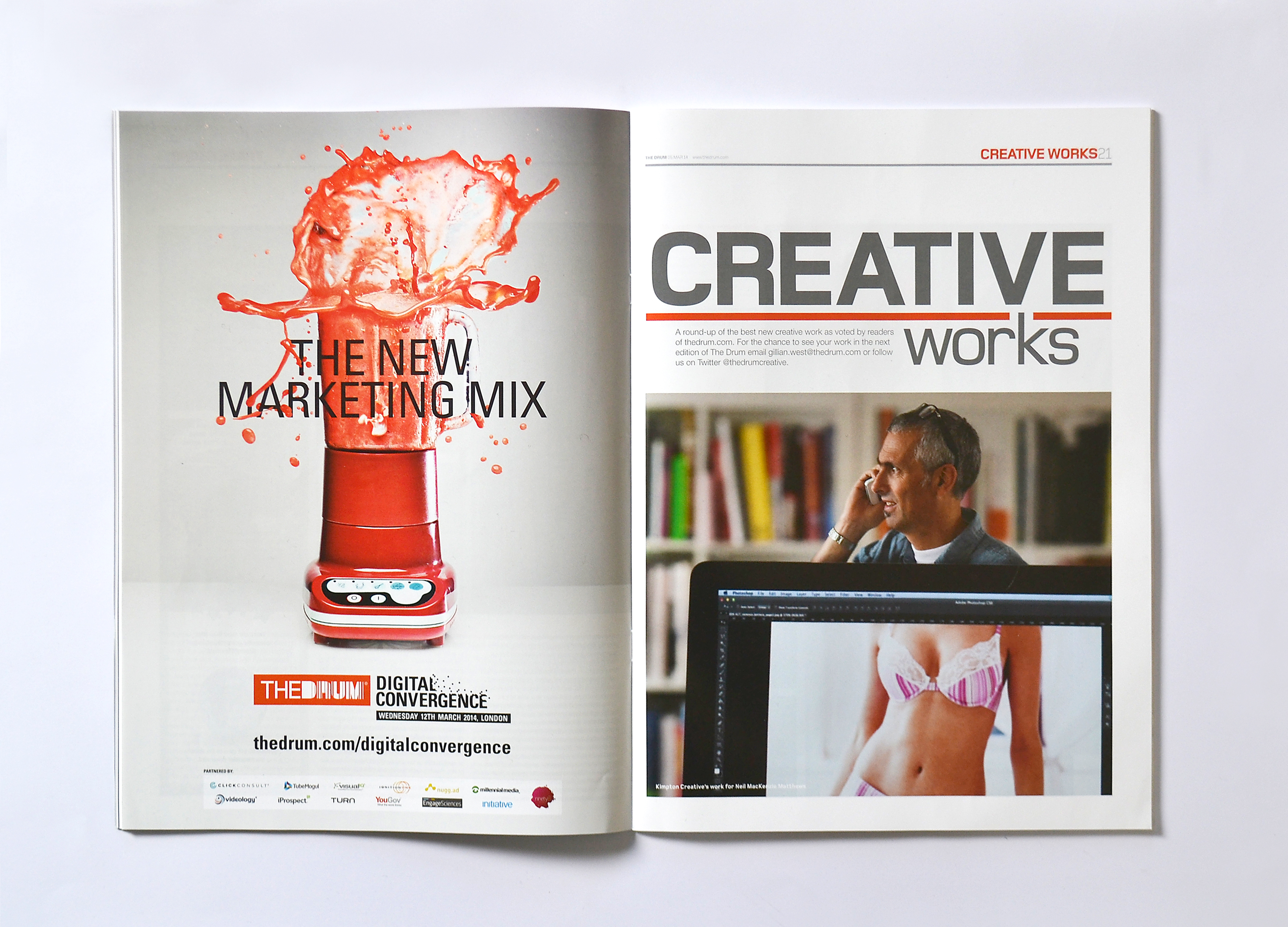
14 March 2014
On a roll…
We’re thrilled that we’ve been featured in March’s edition of modern marketing magazine ‘The Drum’. Our promotional material for Neil MacKenzie Matthews is featured in the ‘Creative Works’ section after being voted for by readers online.
See the case study here
-
-
25 December 2013
Wishing you a Merry Christmas and a Happy New Year
Whilst we celebrate Christmas 2013, we also remember the victims of Typhoon Haiyan in the Philippines. This year instead of printing a Christmas card, we are donating the cost to the Philippines Typhoon Appeal. From all of us at Kimpton Creative.
-
-
18 December 2013
Victoria bound – marketing campaign
We’re delighted to announce that we have been appointed by Tishman Speyer to start a marketing campaign for their 320,000 sq ft office building in Victoria, after a four way pitch. We’re very excited to be involved.
-
-
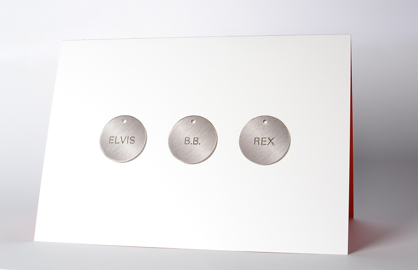
11 December 2013
Happy howlidays!
Continuing our fantastic relationship with Dogsbuddy, a dog walking and pet sitting service in SE London, we’ve designed their Christmas card with canine name tags featuring kings names. The greeting inside wishes you a ‘Merry Christmas and a Yappy New Year’.
-
-
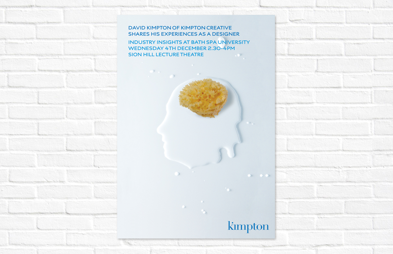
28 November 2013
Soaking up creativity
David is giving a talk to some Bath Spa University design students on Wednesday 4th December, sharing his experiences as a designer. This inevitably prompted a conversation about creating a poster. The ‘solution’ was always going to be something involving a bath!
-
-
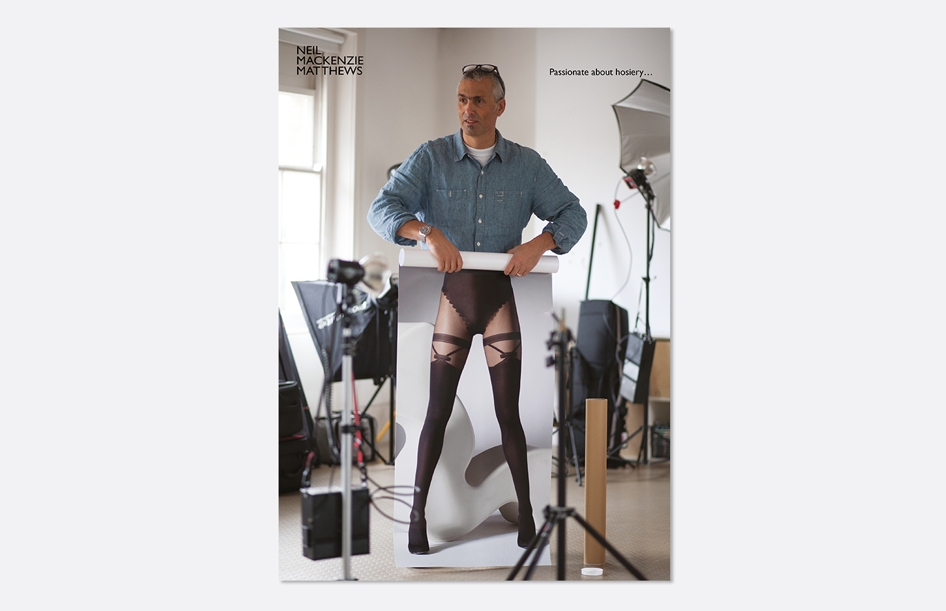
8 October 2013
Behind the scenes…
We have just been working with photographer Neil MacKenzie Matthews to promote his photography. He specialises in beauty, fashion, lingerie and hosiery. We designed a set of images that are being sent out as a series of cards, to highlight his specialism and passion for what he does. This is being sent to creatives, which led us down the path of a playful execution. See the case study here.
-
-
5 August 2013
Fresh as a daisy
We’re delighted to have been shortlisted for the Rhoda Maw Garden Design identity at the Fresh Awards 2013. The announcement of the winners is in September, so fingers crossed. See the project here.
-
-
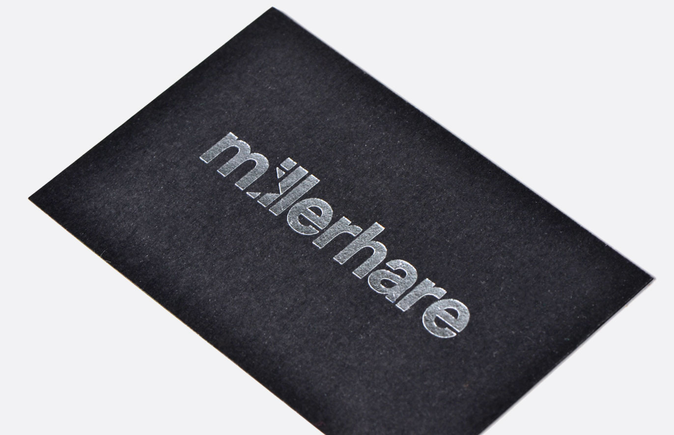
29 July 2013
Visualising the future of property
We have just completed a brand identity and website for Millerhare, a 3D visualisation company operating in the property sector. Polygonal modelling’s most simplified form is a triangle, the basis of everything they do. Whenever they touch client projects, magic happens. Click here to see their site, or here to see their case study.
-
-
19 July 2013
Seeing the light
We’ve just designed a brand identity for Intuito Coaching, a new way of delivering business coaching to business owners and leaders. Benefit focused, they shine a light on issues and territories that need developing both professionally and personally. Coincidentally, Intuito Coaching abbreviates to IC. A good prefix to messages. Case study here.
-
-
3 July 2013
Going dotty for oil
We’ve just been working with Raven, who have developed mapping software to help identify sources of oil. They are attending a series of industry trade events, for which we provided exhibition stand graphics and a little brochure to hand out. A brand identity and website follows. You can see the stand at EAGE13 here: pic.twitter.com/QwnqMlEFmo
-
-
22 February 2013
Furry tails
We have just completed the identity and website for Dogsbuddy, a new dog walking and pet sitting service in SE London. A service that puts the welfare and happiness first, something we were keen to highlight in the logo and on the website.
Click here to see the site and here to see the case study. -
-
23 January 2013
Man’s best friend
We’re currently designing an identity, website and promotional materials for Dogsbuddy, a new dog walking and pet sitting service in SE London. We’ve just commissioned Tim Flach to take photos and video of our four legged friends. Amazing! Results to follow soon.
-
-
4 January 2013
From little acorns…
We start the new year with a brand identity and collateral for new business venture Rhoda Maw Garden Design, which launched in January. If you live in leafy Middlesex and have a tired-looking garden, look no further than Rhoda.
-
-
4 December 2012
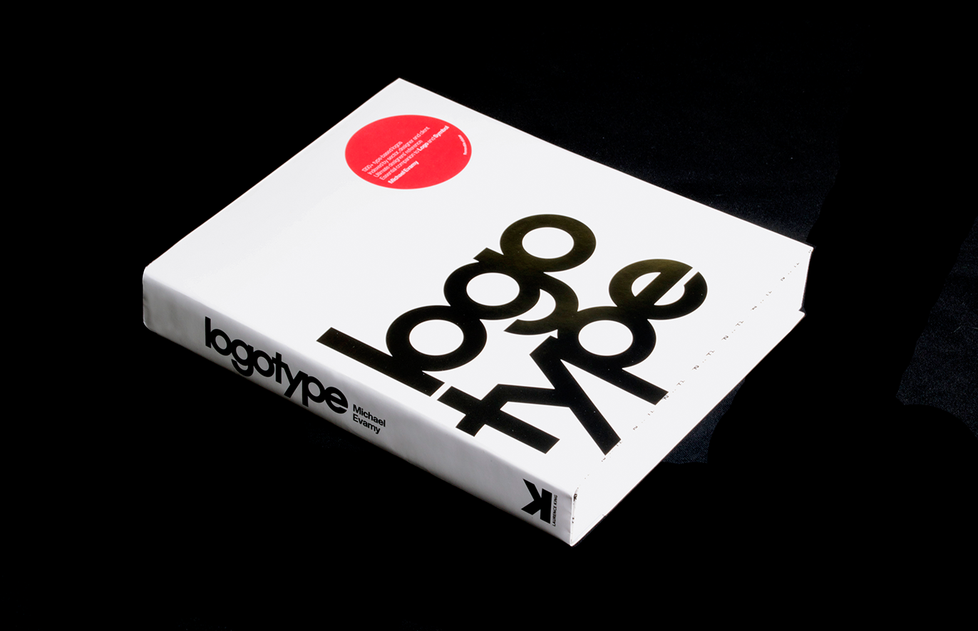
‘Logotype’ hits the shelves
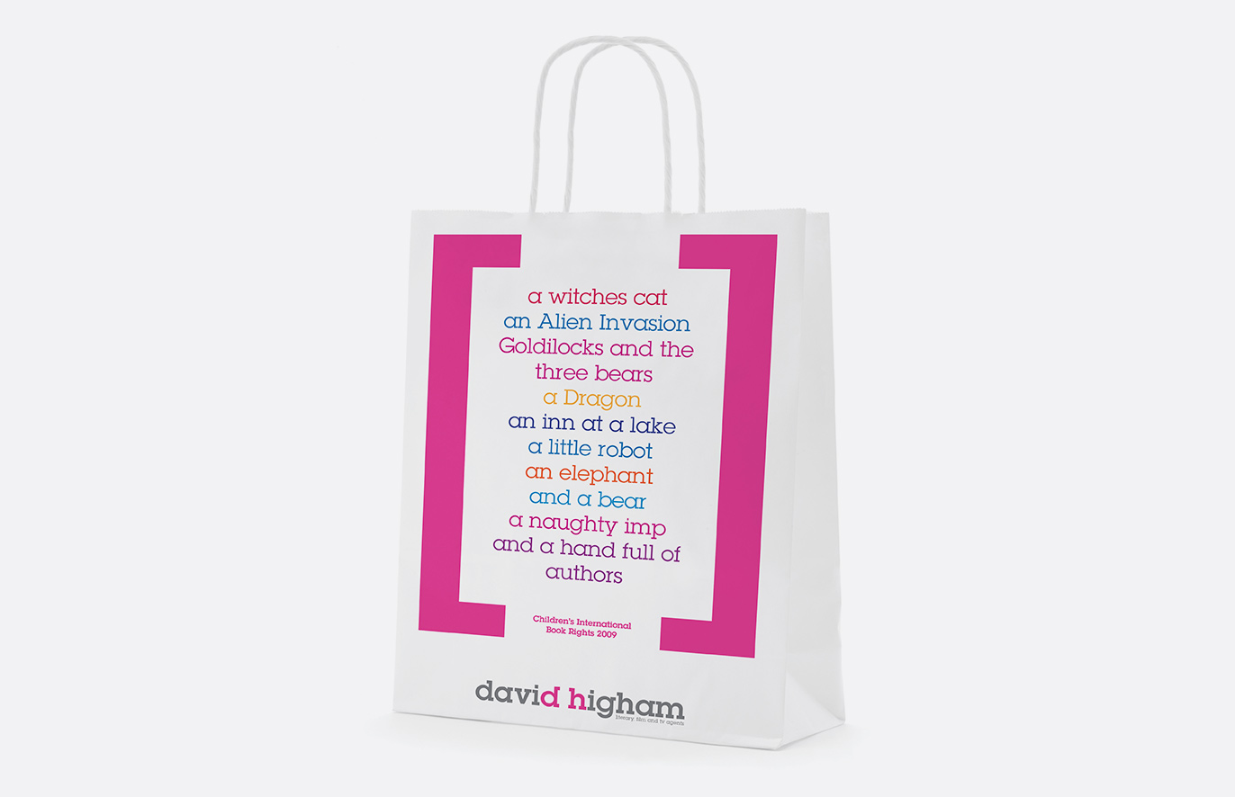
Three identities designed here at Kimpton Creative have been featured in ‘Logotype’, a book just released by Lawrence King Publishing.
They are for Terry Moore Design, interior designers, David Higham literary agents and Nichols headhunters.
-
-
21 September 2012
New growth
We are currently designing an identity for a new venture, a garden design business based in Middlesex.
This will be launching in January 2013.
-
-
30 July 2012
Vítejte – Brand identity
Our latest project is the brand identity, wayfinding signage and advertising for Forum Nova Karolina, a new shopping centre in Ostrava, Czech Republic.
The task is to provide a distinct identity for the centre to build local recognition and understanding of what the centre has to offer.
We will be guidelining how the identity applies to billboards and posters promoting either the centre itself or its upcoming events. Local agencies will then implement the campaigns.
-
-
28 May 2012
Opening new doors
Last week saw the launch of our recent identity and website for Purcell, a leading architects practice, which is involved in evolving some of the best buildings in the UK and abroad.
We will publish the new brand identity as a case study soon, but in the mean time, here is a link to the new website.
-
-
21 May 2012
Celebrating 25 years of service
-
-
6 February 2012
Sharpening up
We‘re grateful to those who have said nice things about our 2012 pencil calendar. It featured in Design Week and on various blogs – it seemed to go down well.
We have uploaded some photos onto Flickr. Click here for a look.
-
-
17 January 2012
Creating clarity
At the end of last year Market Sentinel approached us to inject their brand with a new lease of life and reposition them as a premium consultancy. The new identity has now launched inspired by the core proposition ’empowering our clients to make connected decisions’.
We created a Binary Matrix ‘graphic’ which represents what they do – creating clarity out of complex online information.
To view the case study click here.
-
-
17 January 2012
25 years of service
We are delighted to have designed the marque for the Tennis Foundation’s 25th anniversary.
The marque, shown opposite, will be used for events celebrating their silver anniversary during the coming year.
-
-
6 January 2012
Upward trend
2011 was a tough year for most businesses and 2012 may well be the same.
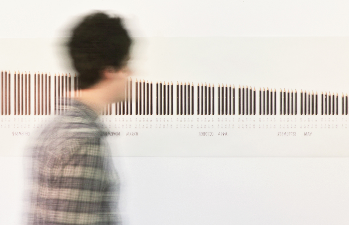
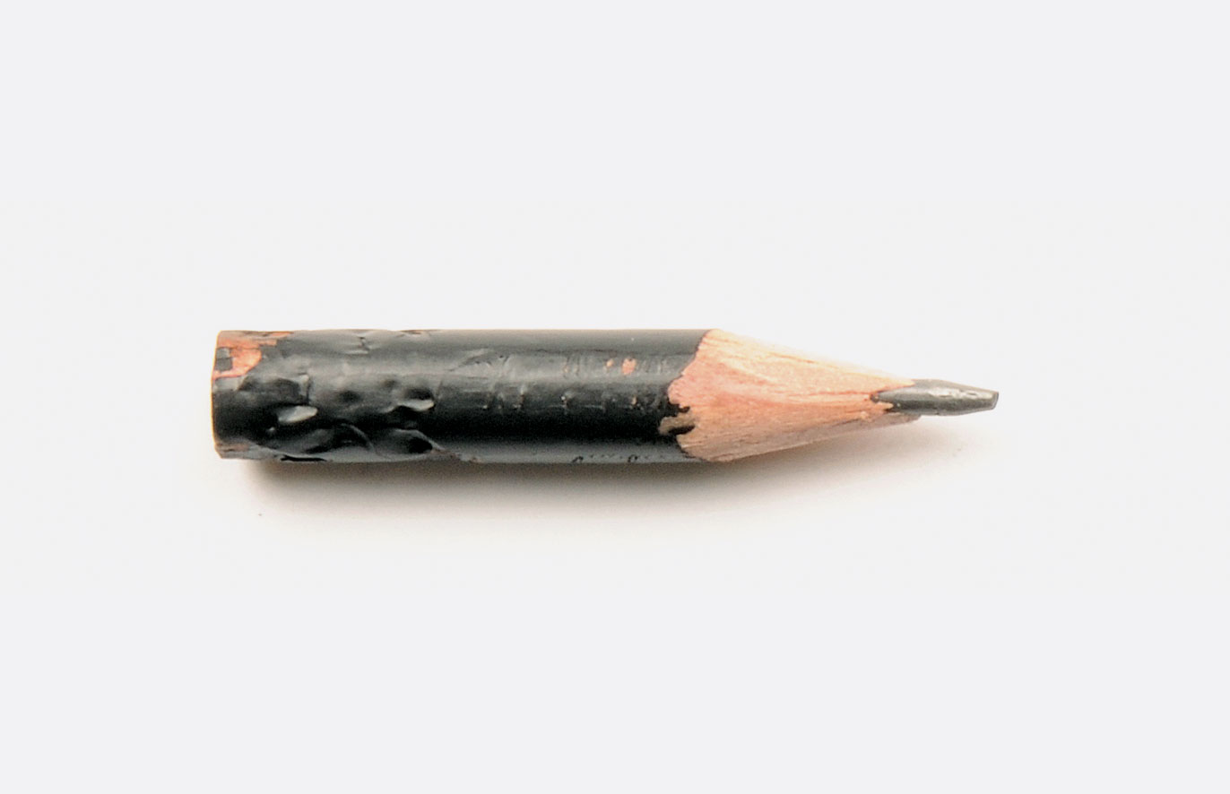
Inspired by our belief that design has an important role in helping business successfully compete in their marketplace we have sent out this message to our clients in the form of a calendar.
The days of the year are represented by a pencil that gets whittled away as the year goes on, reflecting our ideas and creativity.
Half way through the year you turn over the poster, which, printed on translucent material, reveals an upward trend, thereby showing the benefit of creativity to our clients.
Wanna see it? Click here
-
-
16 December 2011
Anyone for tennis?
Last month we were appointed to look at the Tennis Foundation’s identity off the back of our work for the Lawn Tennis Association.
The Tennis Foundation is Great Britain’s leading tennis charity and promotes tennis as an inclusive sport for all abilities, engaging with all areas of the community to improve access and enjoyment.
The Tennis Foundation is the charitable arm of the LTA and their identity needed updating in line with the refreshed LTA brand identity.
It will roll out in 2012.
-
-
21 November 2011
New balls please
We are proud to announce that we have been working with the Lawn Tennis Association since May this year to re-fresh their brand identity.
The LTA is the governing body for British Tennis and their purpose is to grow and sustain the sport.
The refreshed logo is beginning to appear and the broader brand identity will be rolled out in the New Year.
-
-
14 October 2011
Avoiding the hazards
Digital Arts Magazine asked us to tell them about any horror stories we had of working with nightmare clients.
Thankfully we had none to give, but instead offered up our experiences and insight into forging good relationships with clients and working collaboratively to avoid conflicts.
To read the article click here.
-
-
6 September 2011
Wish you were here
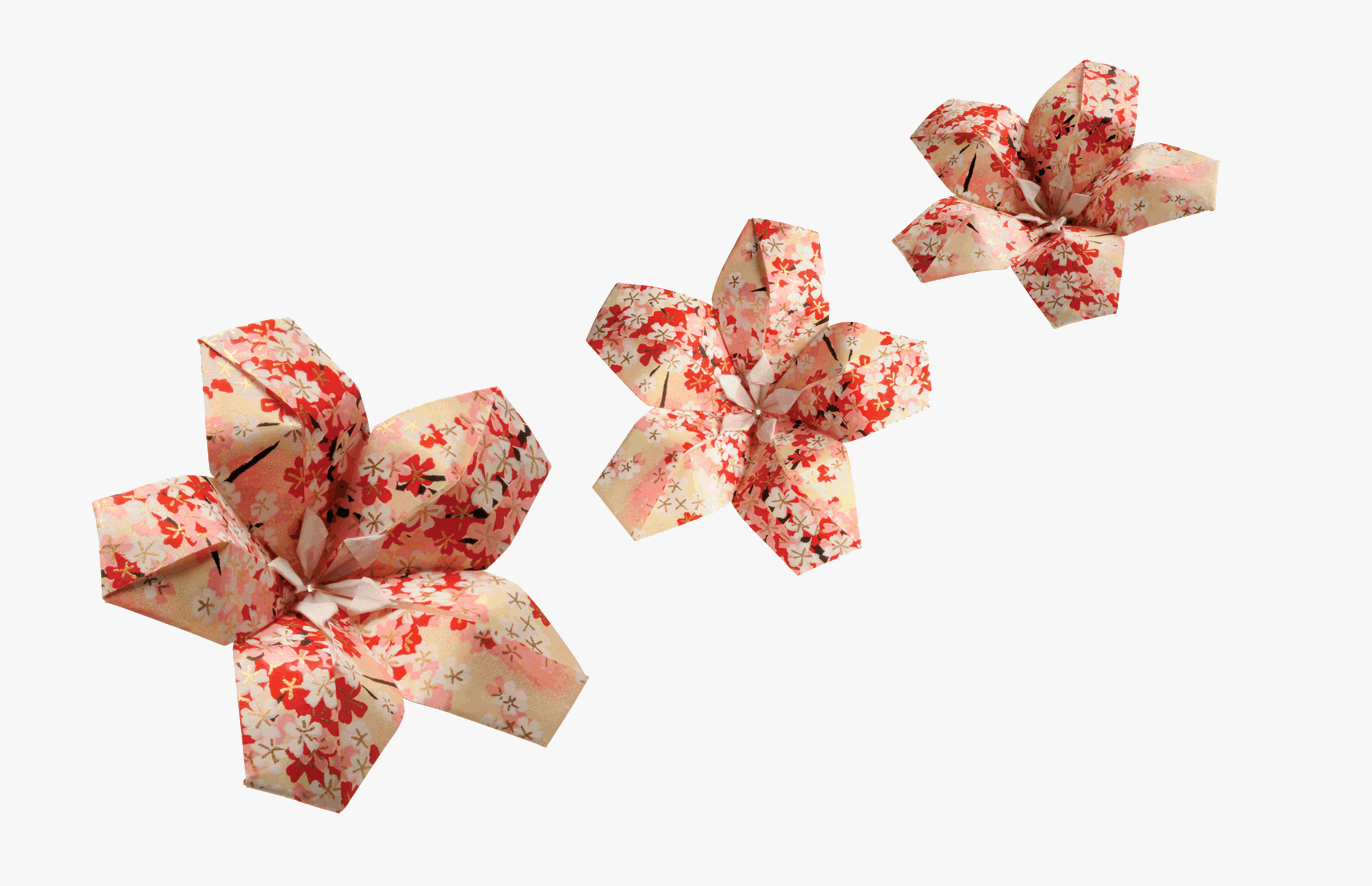
We can finally show you the Exhibition Sheet we designed to mark PhilaNippon, the 2011 World Stamp Exhibition in Yokohama, Japan.
The sheet features origami models (which travelled all the way from Japan), celebrating Japanese history, culture and art.
The sheet was commissioned by Royal Mail and was officially issued on the 28th of July. It can be purchased on the Royal Mail website here.
-
-
21 June 2011
The sharpest solutions
We received some good news today. Our re-branding for Terry Moore Design has been shortlisted for the Blades Awards in the Design (Branding) Category.
The Blades are the only creative awards scheme to be judged solely by clients, and put client opinion at the forefront to pick the best creative work of the year.
The winners will be announced in September so fingers crossed!
To see the project click here.
-
-
9 June 2011
Closing the deal
Design Week asked David for his advice on how to give the Perfect Pitch.
His words of wisdom feature in this week’s issue.
To read the article click here.
-
-
1 June 2011
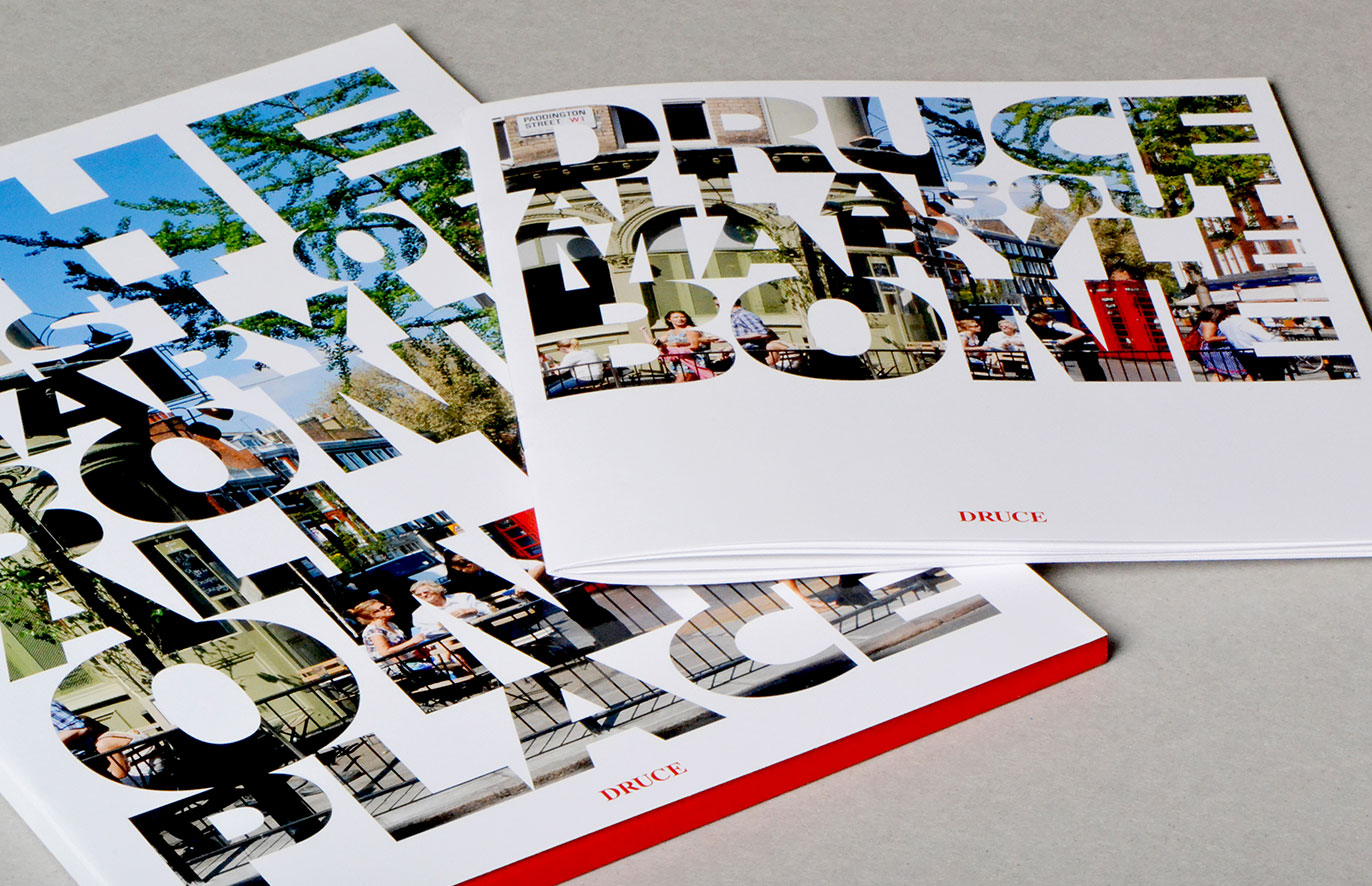
All about Marylebone – property brochure
We recently finished a new property marketing brochure for Druce, a leading Estate Agent based in Marylebone, and today it arrived back from the printer. They are out and out Marylebone specialists, having been there since 1822! Therefore the theme was around living and breathing Marylebone in everything they think, say and do.
-
-
26 April 2011
Another happy customer
Last week we received a kind note from the Managing Director of Nichols. We have just finished working on the Nichols Forum, a thought leadership piece.
This is what he had to say:
“I wanted to thank you and congratulate you on the work you did for us on the “Forum” publication. The end result was fantastic and a very high class publication that I am sure will impress our clients and raise our profile. The creative input was of an exceptionally high standard and the general advice and help in bringing the project to completion was superb.”
Any time.
-
-
14 April 2011
Coming into focus
Over the last couple of months we have been working hard on Nichols Forum, a thought leadership piece, sharing inight from key industry figures into the potential of Emerging Markets.
Nichols are international headhunters who specialise in the consumer goods and healthcare sectors. Nichols Forum will be sent out to global businesses to promote their expertise, knowledge and experience.
To view the whole brochure, please click here.
-
-
25 March 2011
Blue sky thinking
A mailer we’ve just sent out to coincide with British Summertime, hailing a ‘brighter’ future!
Click here to take a peek.
-
-
24 February 2011
Realising dreams – new identity
This week sees the launch of our new identity for Pure France, an online French rental property business, which featured in today’s design week.
To find out more click here
-
-
23 February 2011
-
-
17 February 2011
25 years insight
Design Week invited David to write an article for their Insight feature reflecting on his 25 years working in the design industry.
To read the article click here.
-
-
11 February 2011
Extraordinary support
We are currently in the latter stages of a new brand identity and website for Cyrenians – a wonderful charity based in London providing help and housing to vulnerable people.
They work with a wide range of needs from young people or the homeless to adults with severe mental health needs. They aim is to empower individuals who come to them.
“We develop life skills and aim to develop an individual’s potential to live an independent and fulfilling life, with a goal to to integrate them back into their community and our society.”
-
-
3 February 2011
Opening new doors
We’re delighted to be working with Purcell Miller Tritton, an architects practice famed for its conservation work on some of Britain’s best loved buildings.
Their expansion into new areas such as contemporary design has prompted this exercise to help them identify an appropriate image to present to its audiences, new and existing.
We are currently reviewing their brand strategy.
-
-
28 January 2011
Dusting off the soap box
D&AD says it is aiming to become a more ’campaigning’ organisation.
Design Week asked David what issues he would like to see it tackle and why? Cue another rant…
“Universities are chock-a-block and ratios of students to tutors have gone crazy, as much as 37:1. The poor universities are being forced into this situation to survive, but it’s not actually doing anyone any good. There aren’t enough jobs available in the design industry. D&AD would do well to lead a call for change.”
-
-
18 January 2011
Konnichiha Japan
We have just started a new project for Royal Mail working on the collectors sheet for the PhilaNippon 2011 World Stamp Exhibition in Yokohama, Japan.
The sheet will be a celebration of Japanese culture, promote the Royal Mail to the International Philaletic community and be a commemorative collectors piece from the event.
-
-
11 January 2011
I’m dreaming of a…
At the end of last year we started working with a new client, Pure France – a specialist for quality holiday rental homes, villas & chateaux in France.
We will be working on their identity and website over the following months.
If like us, your attention is turning towards summer holidays, check out purefrance.com
-
-
20 December 2010
A New Year to remember!
Design Week asked David how he would be marking his New Year. He responded with festive enthusiasm…
“I will mark the New Year by getting in the festive spirit – which may involve:
Twelve Prides a-sinking, eleven poppadoms a-popping, ten Pinots a-swilling, nine Merlots a-spilling, eight Veuves a-fizzing, seven Bells a-ringing, six Gordons alive-ing, five songs a-killing, four Cointreaus a-quaffing, three Cognacs a-necking, two gloves a-losing… and a ride in an Addison Lee.”
-
-
11 October 2010
Making a mark
We have just completed an identity and website for Terry Moore Design, an interior design company that creates unique contemporary, crafted interiors.
Terry’s name lends itself nicely to this!
We will publish the brand identity roll-out as a case study soon, but in the mean time, here is a link to his new website.
-
-
27 September 2010
And the winner is…
And the winner is…
27 September 2010
Last week we received some exciting news – two of our identity projects have been shortlisted for the 2010 Design Week Benchmarks awards; David Higham in the Professional Services category and Alquity Africa Fund in the Financial Services category.
The Benchmarks award excellence in brand identity and brand communications. They recognise branding programmes with a consistent brand message and a strong strategic concept that works across a range of platforms as well as rewarding creativity, innovation and appropriateness.
The winners are announced on 30th November… fingers crossed.
-
-
16 September 2010
Design education
DesignWeek asked David Kimpton for a comment in response to a hot topic – ‘What do you think can be done to raise the standard of design education in the UK?’
Here is his rant:
‘I’d suggest reducing the number of students. When I was at college there were 30 odd of us in my year and we had access to our tutors constantly. It simply isn’t possible to successfully teach double or in some cases triple that number. The tutors will just be spreading themselves too thin and the students will suffer. I feel sorry for students who attend a course that is more like an Open University. Sadly there aren’t enough positions in the industry anyway.’
-
-
22 July 2010
Vocal Futures launch
Today sees the launch of our identity for Vocal Futures, a new charity foundation that aims to encourage 16-22 year olds to embrace classical music.
The identity uses shards which come together and represent the interaction and connections between performers, audiences, venues, technicians and more.
-
-
3 June 2010
Today’s highlight
We were featured in this week’s Design Week with our identity for the Pearson Diversity & Inclusion team.
-
-
25 May 2010
In full bloom
RBS wheeled out their big guns to host an evening at the Chelsea Flower Show for their most revered (and wealthy) clients. We provided the invitations and collateral. Blooming marvellous.
-
-
17 May 2010
Cutting edge branding…
We have just been commissioned to provide a name and product brand identity for a range of industrial tools which will use diamond picks to enable harder-wearing and more effective digging of road surfaces. This is a real, ahem, breakthrough for this market and will allow road construction companies to dig highways 10 times quicker than currently available.
Good news for all of us!
-
-
12 May 2010
Hitting the high notes
We have just been commissioned to design a new identity for a new charity foundation founded by Suzi Digby (Lady Eatwell to you and me), of Last Choir Standing fame. The charity aims to encourage 16-22 year olds to embrace classical music, particularly choral works. It will do so in a way not done before, by online interaction between the youngsters and the performers or even crew. Blogging and tweeting will bring together all parties. The foundation has chosen to put on a performance of JS Bach’s ‘St Matthew Passion’, a mighty choral works. It will be performed at Ambika P3, a huge concrete industrial space at the University of Westminster.
-
-
15 April 2010
When I grow up I want to be…
Design Week invited David Kimpton to write a piece about his favourite Children’s Book (he always seems to get landed with the really serious academic topics). His response explains a lot…
‘Carlotti Joins the Team’ by the late great Mike Hawthorn, the first British F1 World Champion. Published in 1959 (no, I’m not that old), this is the story of a young lad whose single passion in life is motor racing (that was me) and his only wish is to emulate his hero and become a top racing driver himself (yep). He then gets his chance and… (not me). Somehow I got sidetracked and ended up colouring-in.’
-
-
25 March 2010
The perfect image
We stumbled across a great photographer (Eric Lafforgue) whilst looking for African portraits on Flickr. This led to us buying some of his powerful images and this subsequent contribution to an interesting article about the creative use of stock images.
-
-
25 February 2010
Alquity launches
We are in Design Week this week, with the newly completed naming and branding for Alquity Investment Management, an ambitiously novel new model for investing, based around giving something back – African micro-enterprises that Alquity invest in receive a percentage of profits, thereby feeding a cycle of altruistic investment (hence the theme of reciprocity used for the fund logo).
-
-
11 February 2010
David Higham
This week Design Week features our identity for David Higham, one of the UKs leading literary agencies, whose authors include Jacqueline Wilson and the ubiquitous Stephen Fry.
Probably the best spell-checking client we’ve come across!
-