SimpsonHaugh
They were previously called ‘Simpson Haugh and Partners’, giving the impression that there are two individuals leading the practice. Moving forward, this won’t necessarily be the case, so they were keen to appear as an entity rather than as individuals.
We held workshops in Manchester and London, their two offices to redefine their brand strategy. This involved a selection of staff across the ages and skill sets of the practice.
It became clear that there is a powerful combination of very precise, repetitive analysis that goes on and big picture ‘great’ architecture. this is captured in their core proposition: ‘Beautiful design, responsible and uplifting’.
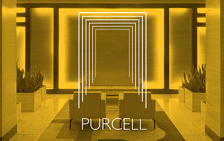
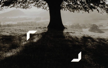
This inspired our solution, which uses a set of patterns that use a shape that both morphs into something else, but also looks like it is being analysed from every conceivable angle in a series of repetitive steps.
The logo joins the two names into one entity, presented in a style that looks more logotype than font, architectural in nature.
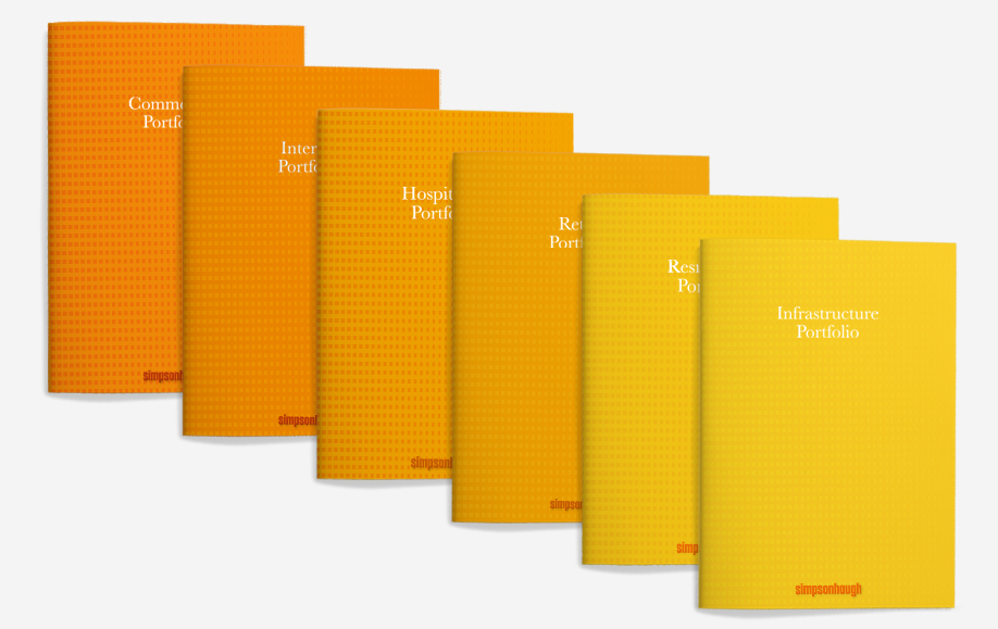
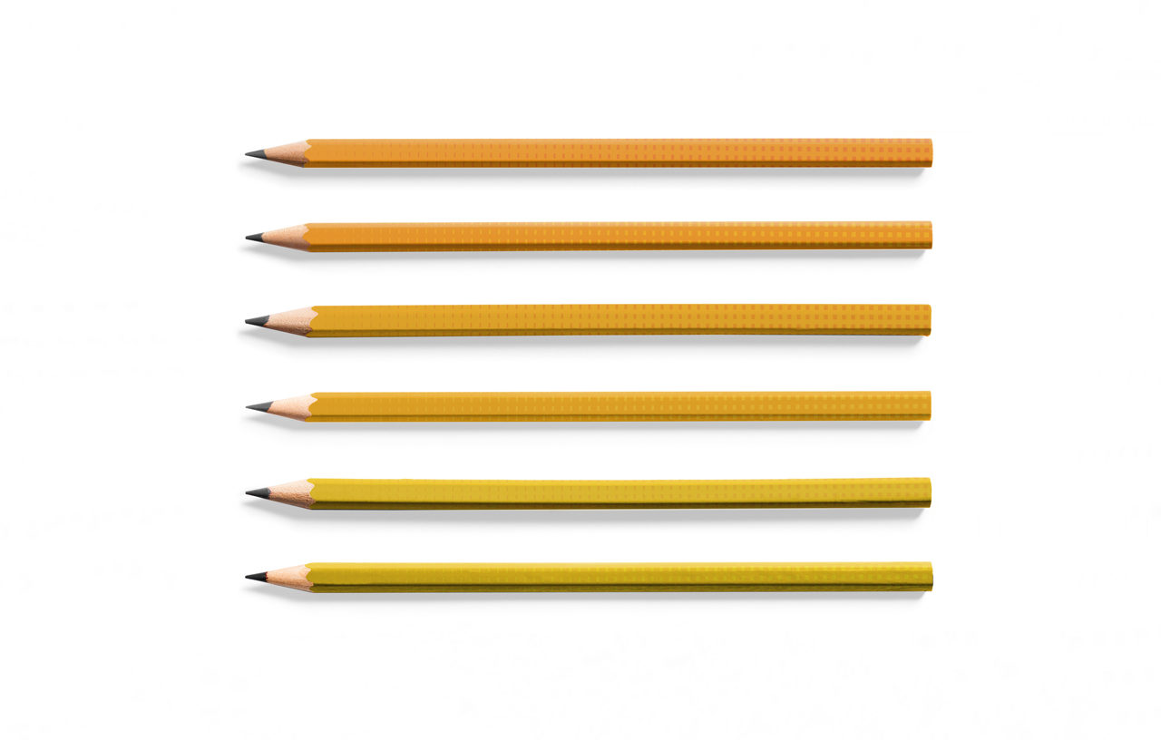
We created a range of colour combinations in the yellow to orange spectrum, which when applied to the pattern, gave them a distinct backdrop.
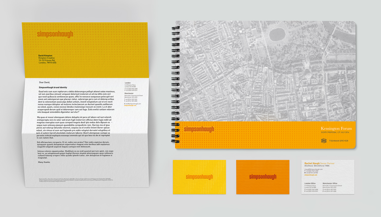
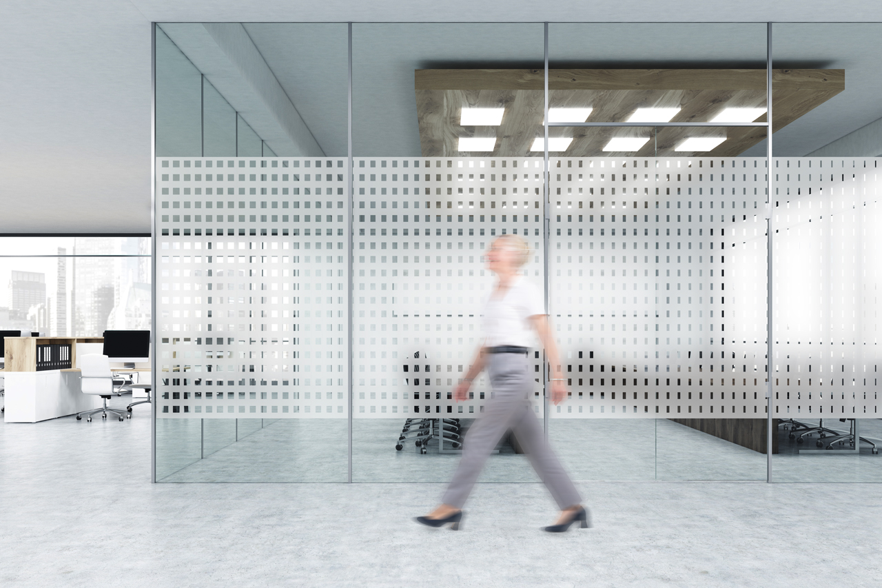
The refresh is being rolled out by the in-house design team, applied to stationery, reports, bid documents, brochures and office graphics.
- Brand identity
- Brand strategy
- Literature
- Powerpoint templates
- Stationery
- Word templates
