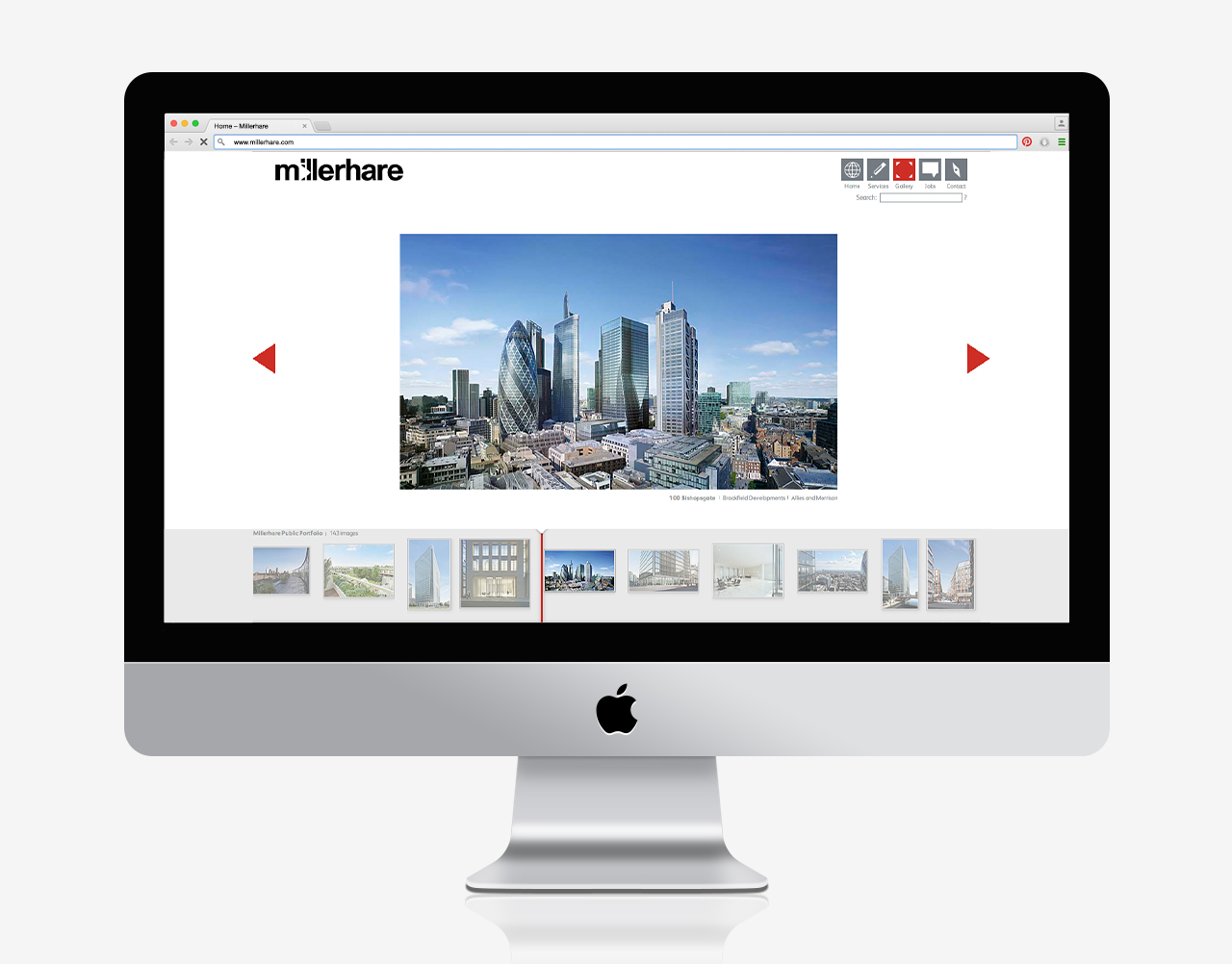
Millerhare
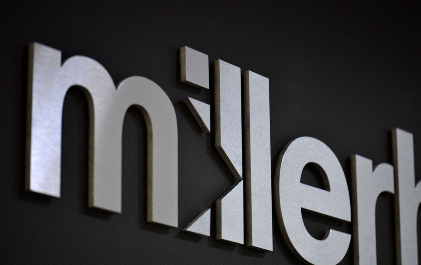
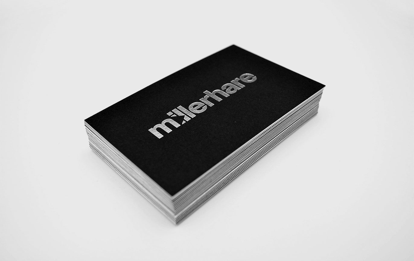
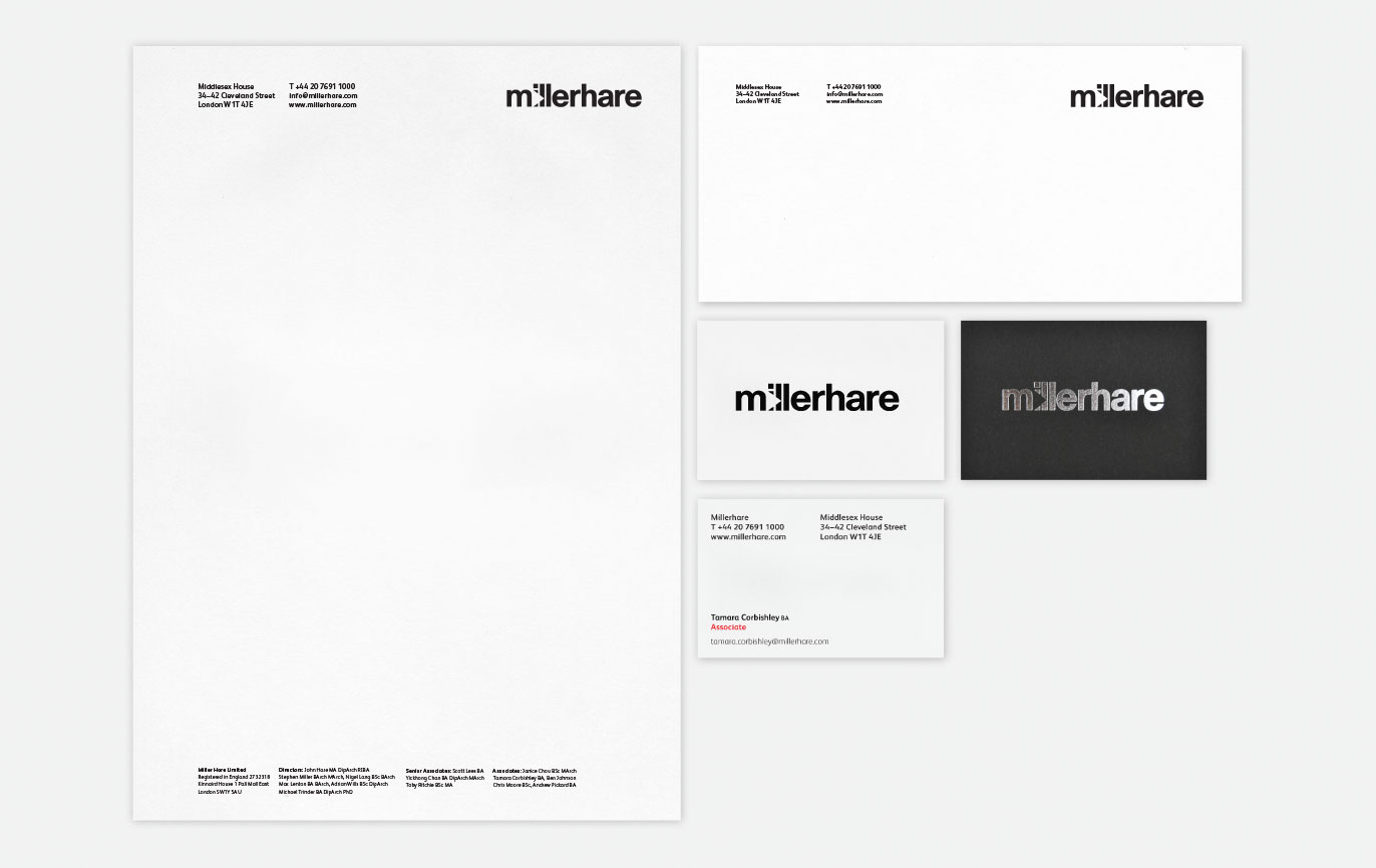
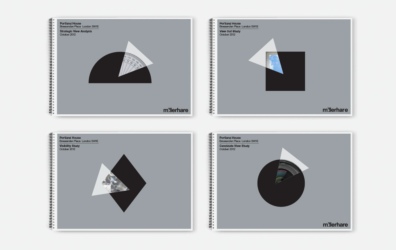
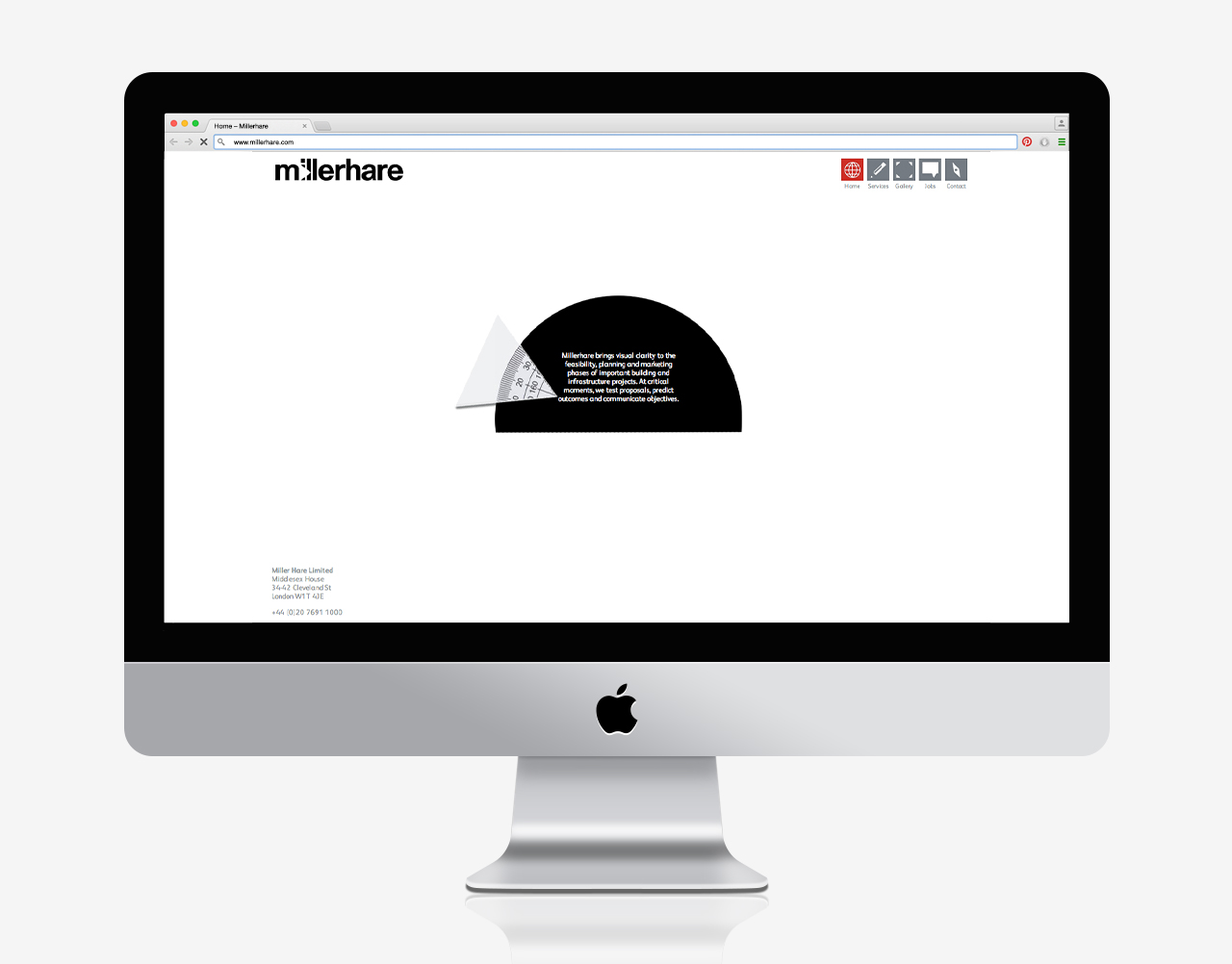
What we identified was that they are brought in at various points during the process and at those touchpoints on a project’s journey they add magic. This might be in the form of expert consultancy or the incredibly lifelike images they create. We designed a logotype that incorporated the simplest form used in polygonal modelling, a triangle. This becomes the cornerstone of the identity in application. Where the triangle overlays a shape, it comes to life, representing their ‘midas touch’.
Another interesting aspect was combining the two names of the founding partners in a single brand name, which makes the company an entity in its own right, not just about individuals. This is exactly the same discussion we had with simpsonhaugh architects.
Read more...
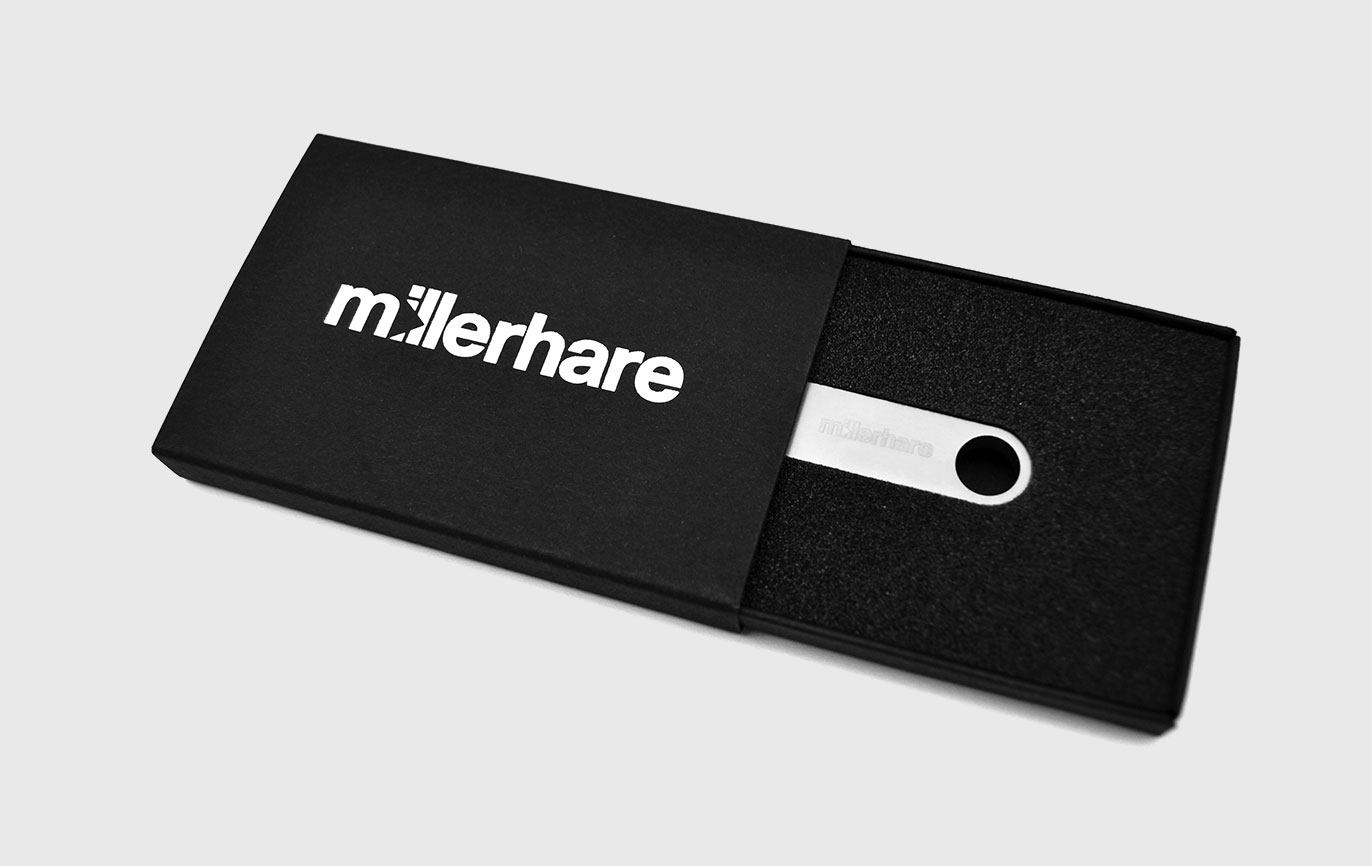
- Brand identity
- Event graphics
- Literature
- Powerpoint templates
- Promotional items
- Signage
- Social media
- Stationery
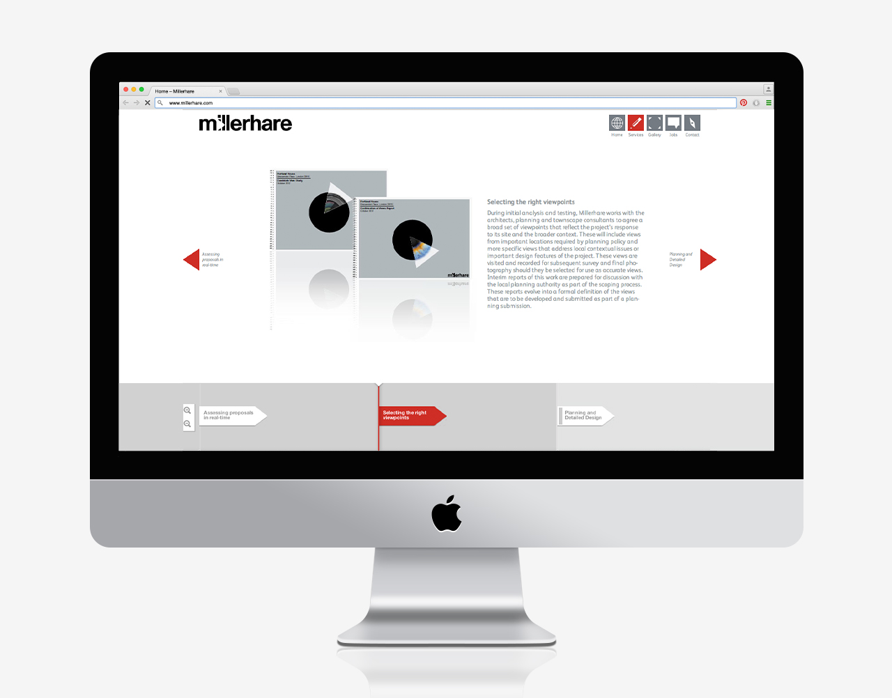
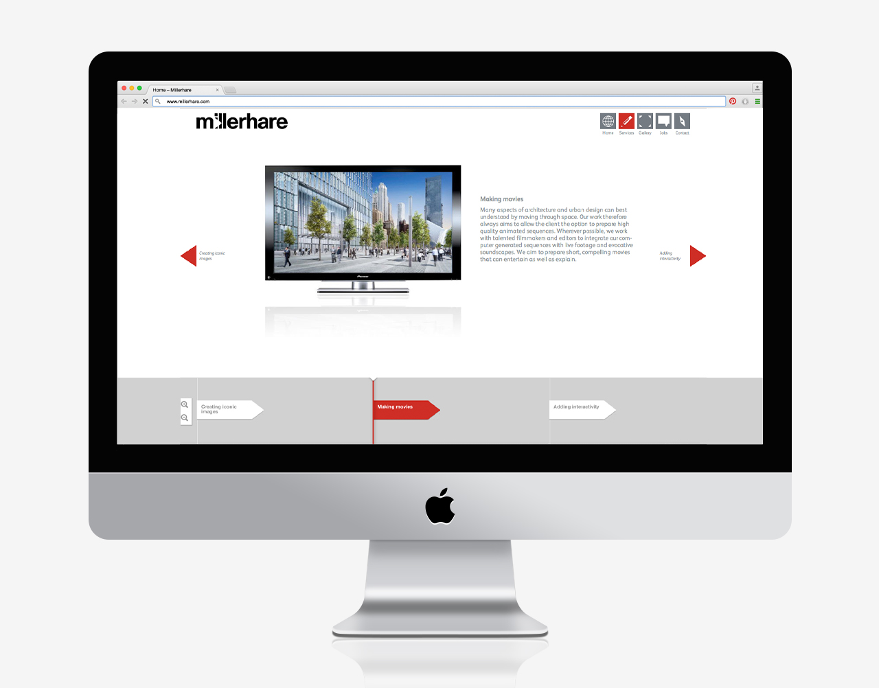
- Web design
- Word templates